M(E)
Branding for three-layer poly bags that combine the industry’s best odor and deodorant control properties with a calm and elegant design.
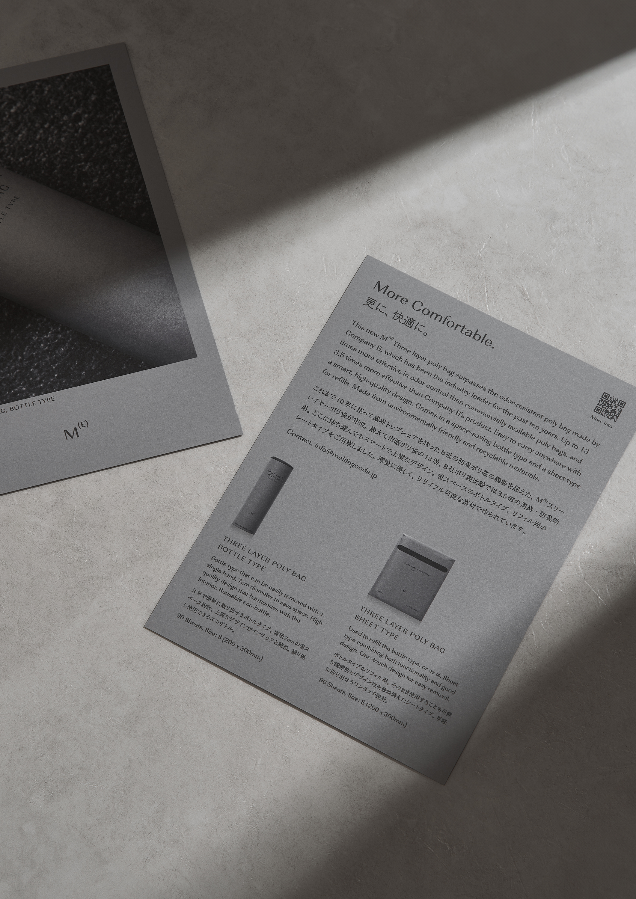
“M(E) three-layer poly bag boasts up to 13 times more odor prevention and deodorization than commercially available plastic bags. Adopts a newly developed three-layer structure consisting of a deodorizing layer that absorbs odors, an anti-odor layer that blocks odors, and a protective layer that increases strength. It is an environmentally friendly olefin material and has excellent recyclability.
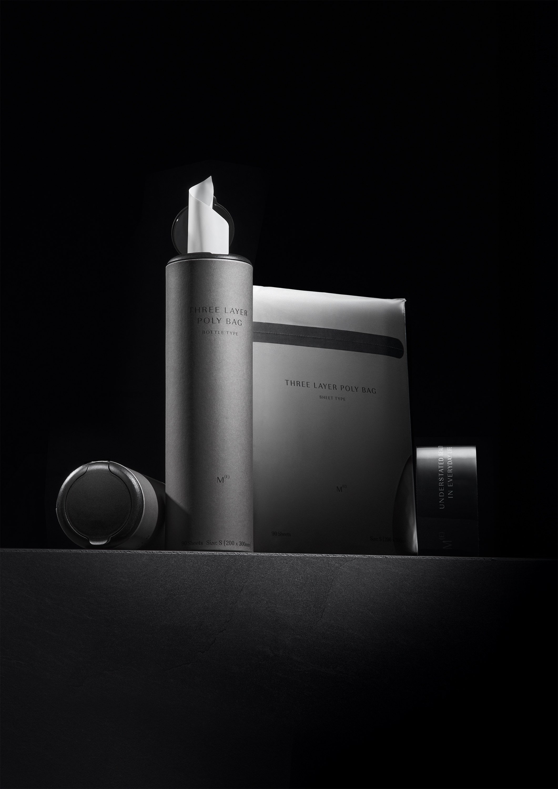
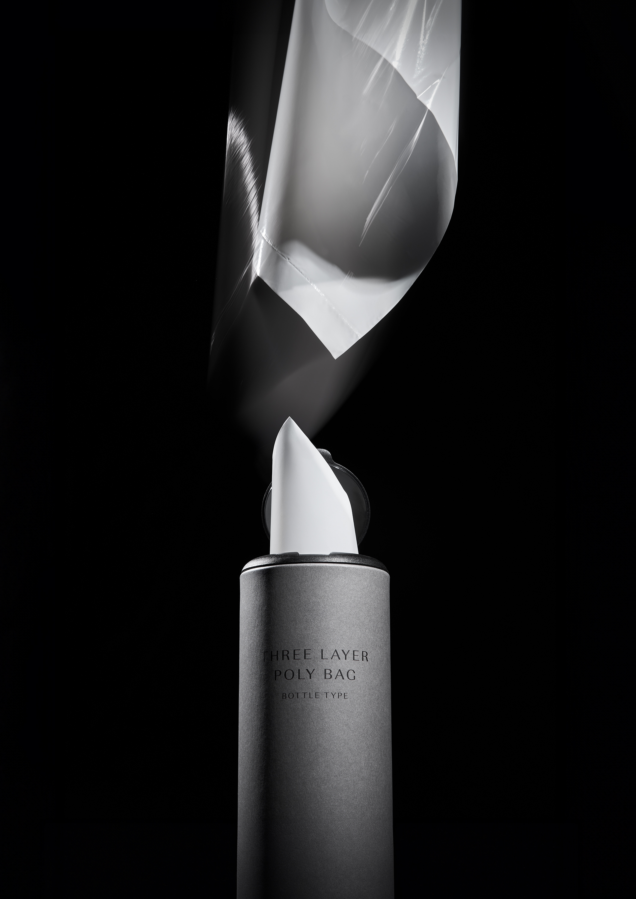
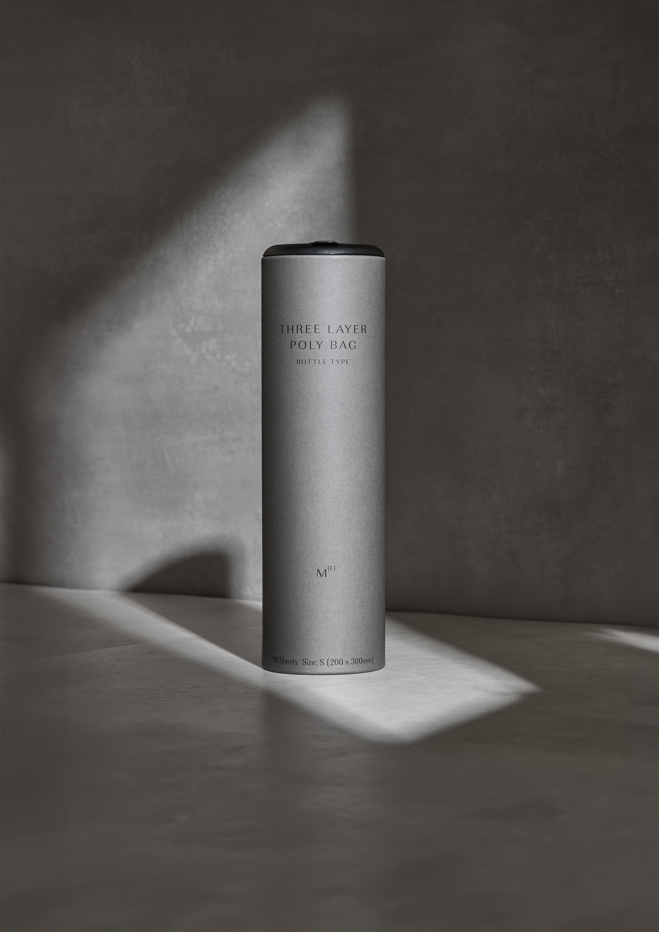
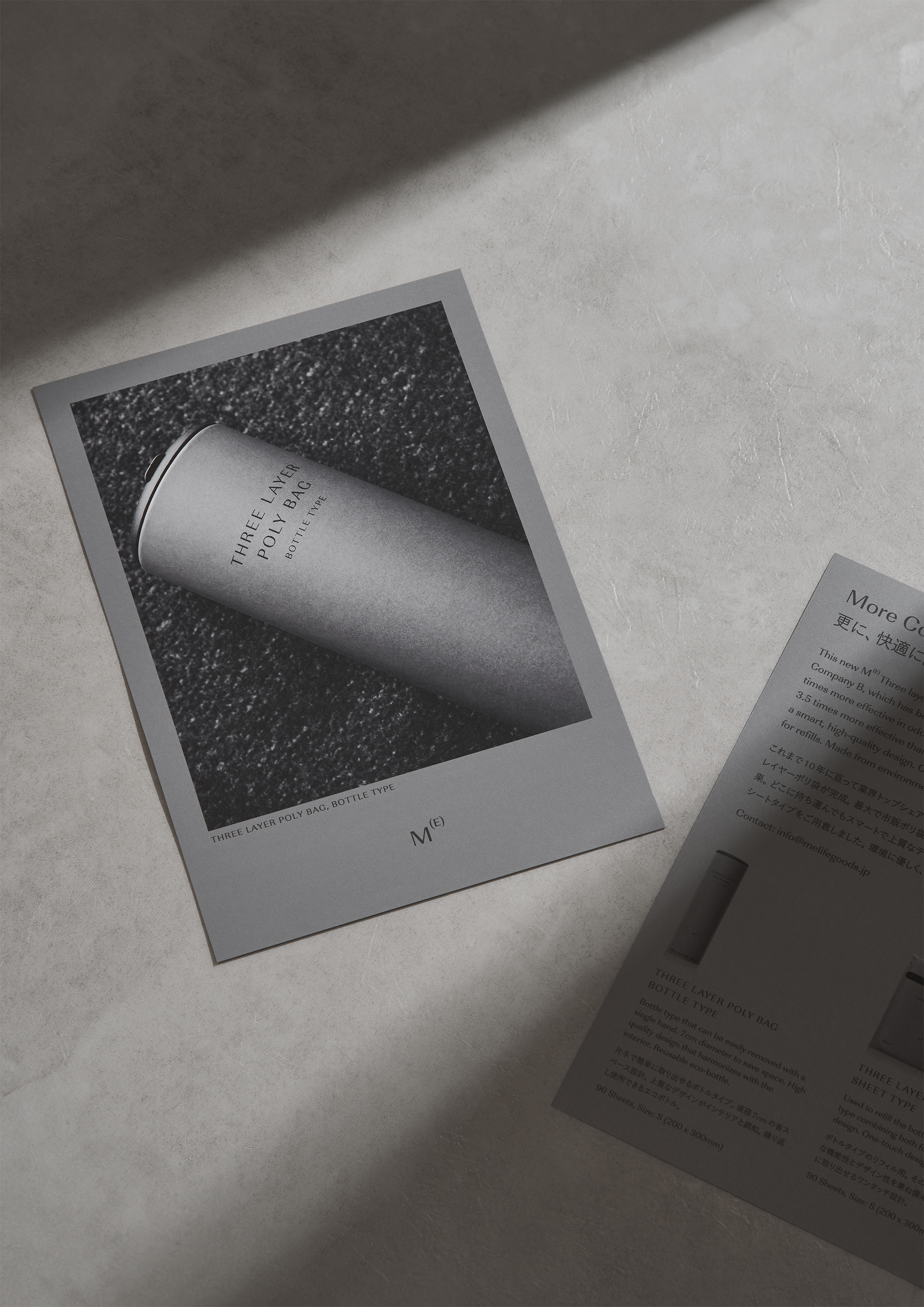
A sophisticated design that overturns the concept of conventional plastic bags. The bottle type, with a diameter of only 7 cm, fits in any dead space and uses a pop-up type (patent pending) that allows it to be taken out with one hand and with a single touch. A simple and calm design and functionality come together.”
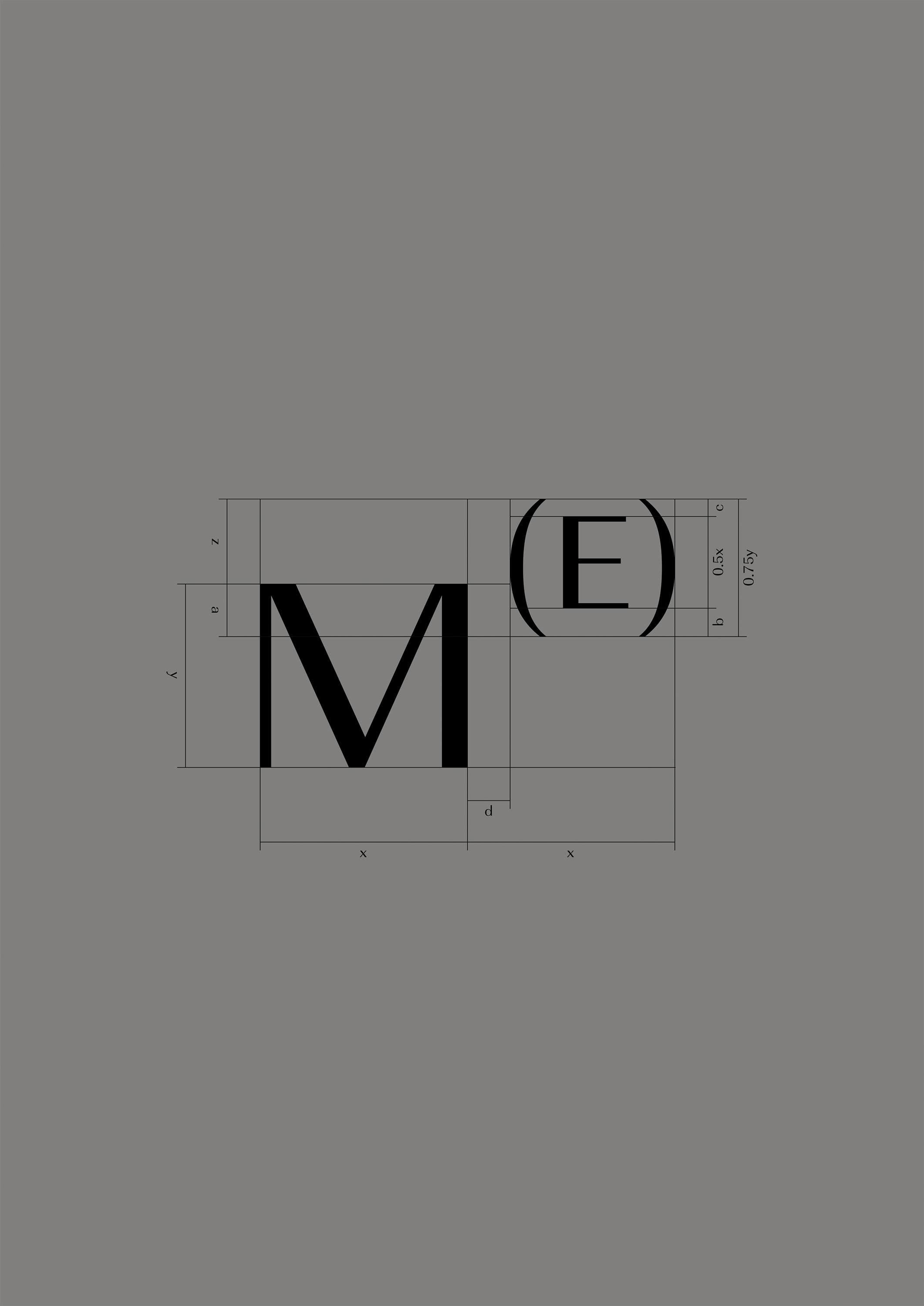
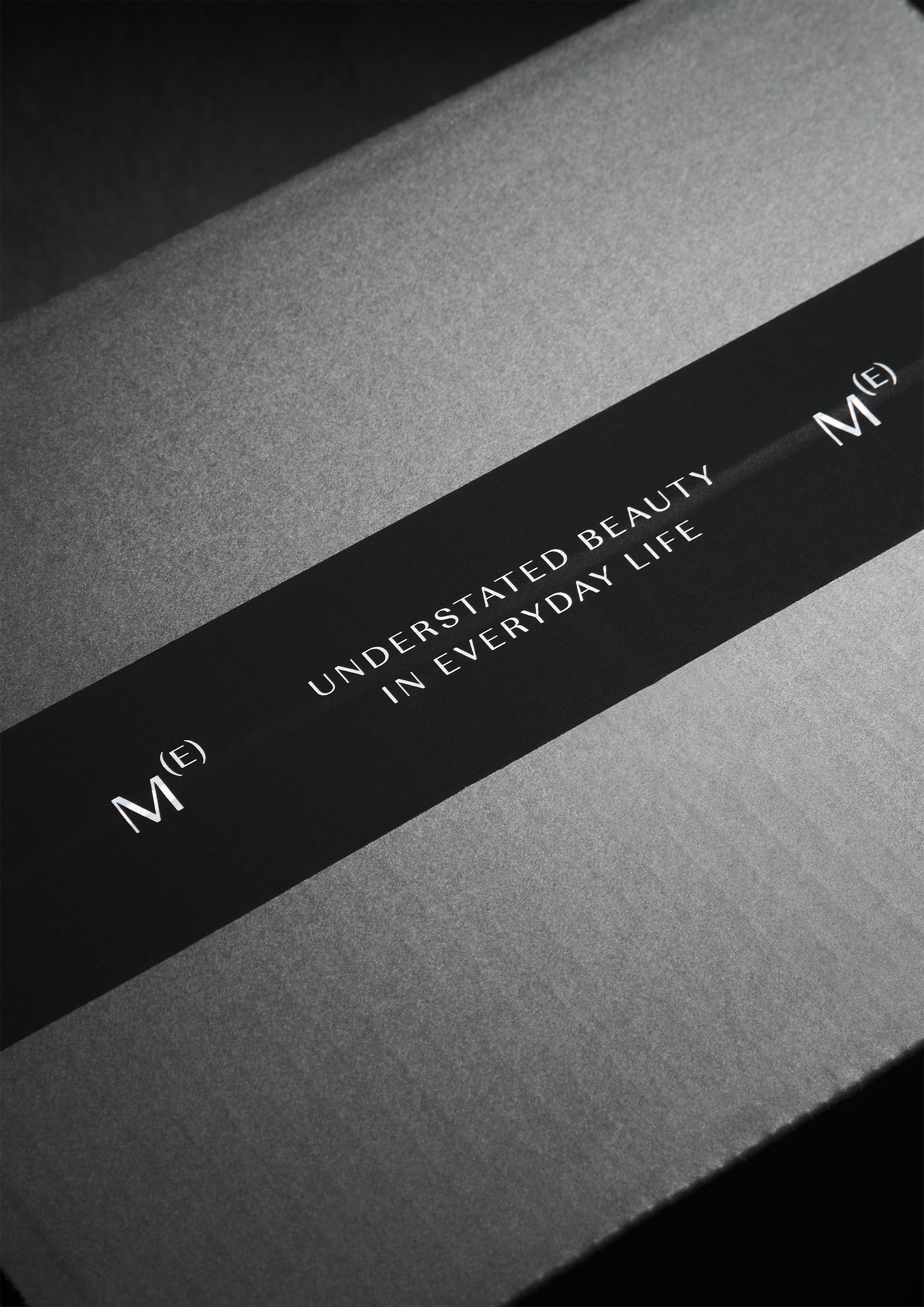
“The brand name is from the Japanese word ‘めっちゃかっこいー(Metcha Kakko E)=So cool’, the first letter of ‘めっちゃ’ is changed to ‘M’, ‘かっこ(brackets)’ are changed to ‘()’, and ‘いー’ is changed to ‘E’ is rearranged and read as M(E). The logotype, which resembles a chemical formula symbol and was created from this sense of humor, follows M(E)’s philosophy of ‘fulfilling its function as a daily necessities by not making a statement in the space or demonstrating individuality.’”
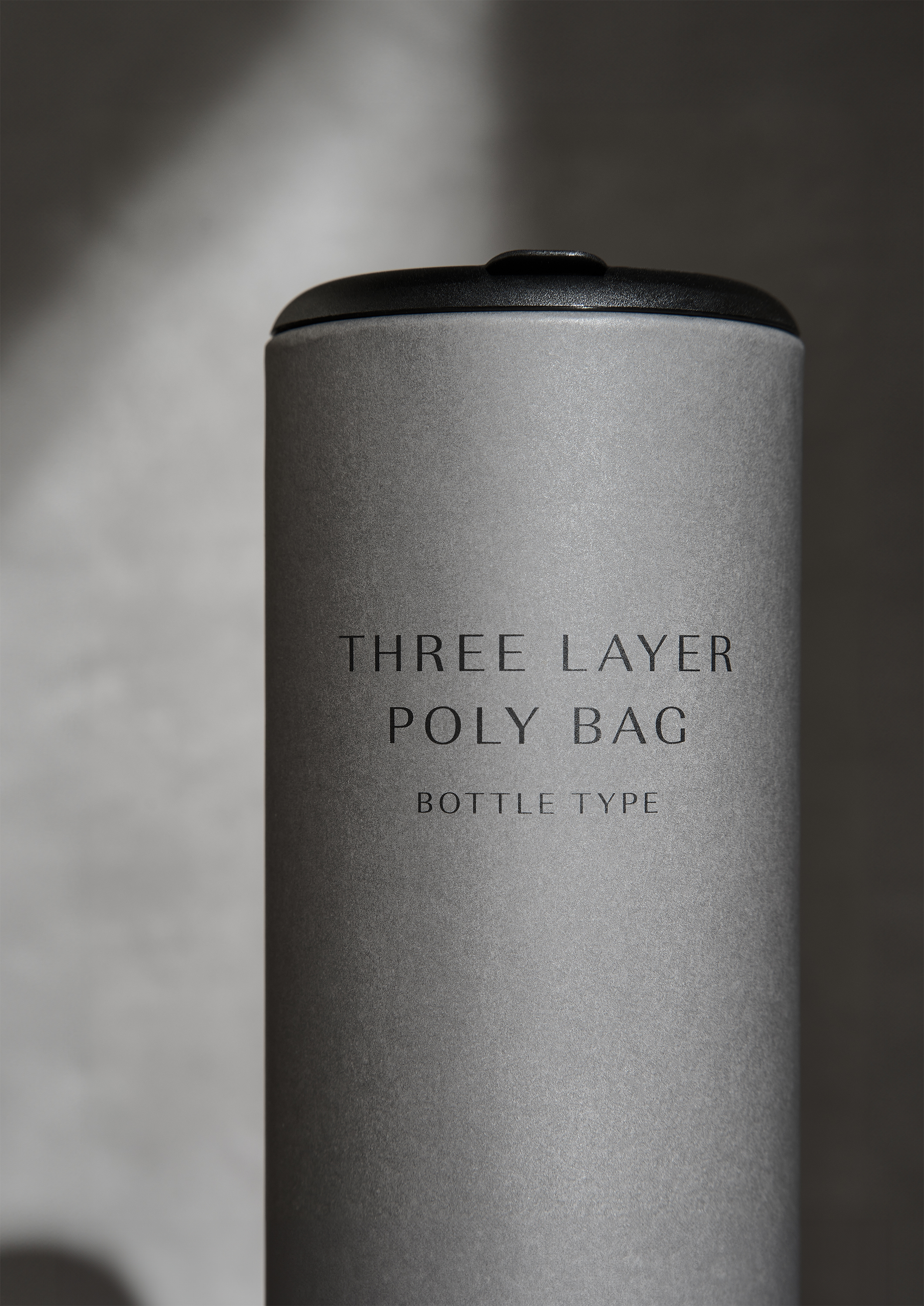
“The typeface URW Imperial, with a shape somewhere between serif and sans-serif, combines elegance and neutrality to complement the brand’s impression.”
“The bottle paper uses FSC-certified paper that is properly produced while protecting forest biodiversity and the rights of local communities and workers. The ink is free from volatile organic compounds such as toluene, xylene, and ethyl acetate. We use VOC-free, environmentally friendly ink.”
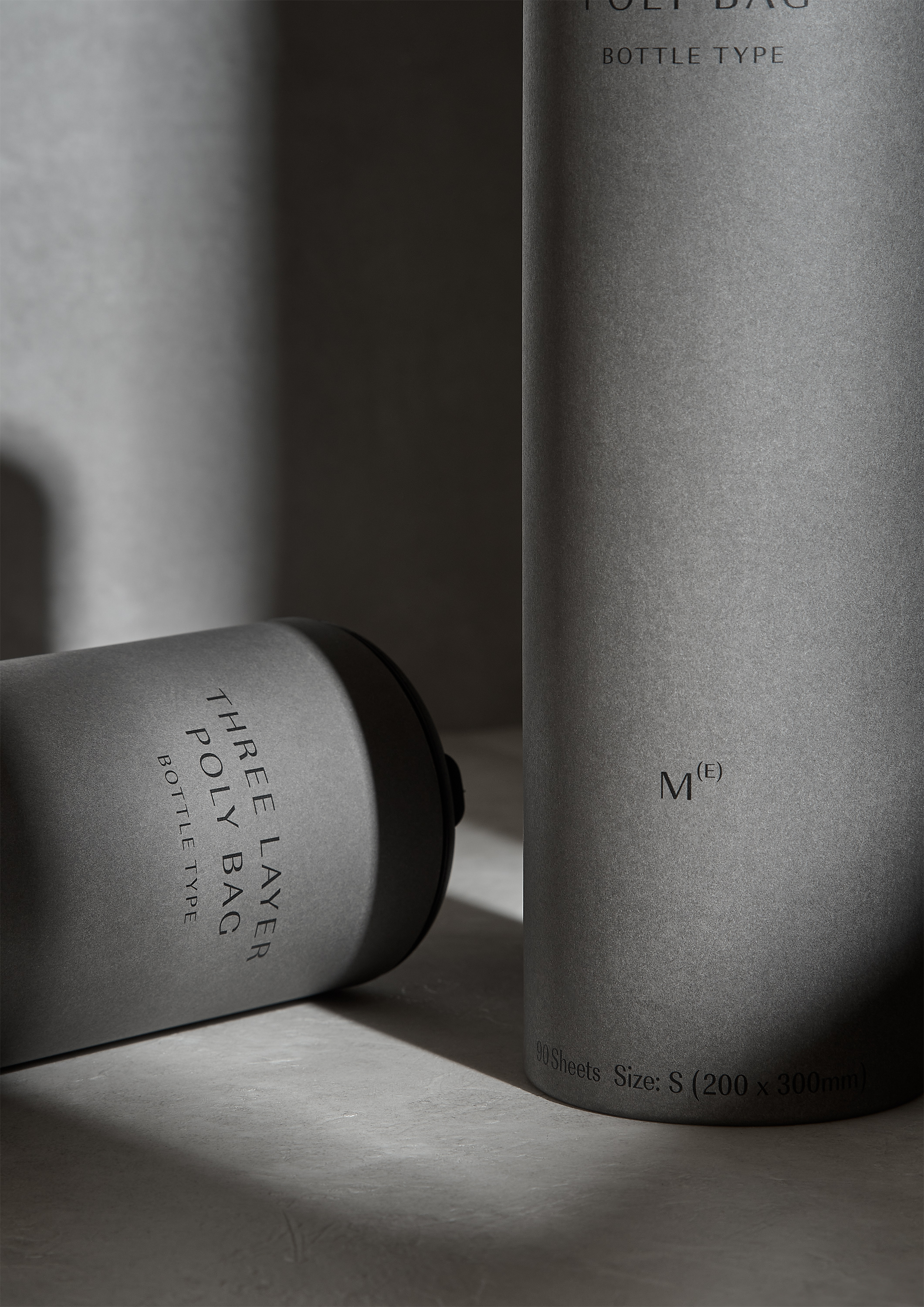
“This exquisite color, named ‘Swai Grey’, is inspired by the way smoke rises slowly and then disappears into space. We envision products supporting our lives from the shadows as daily necessities, without making a statement.”
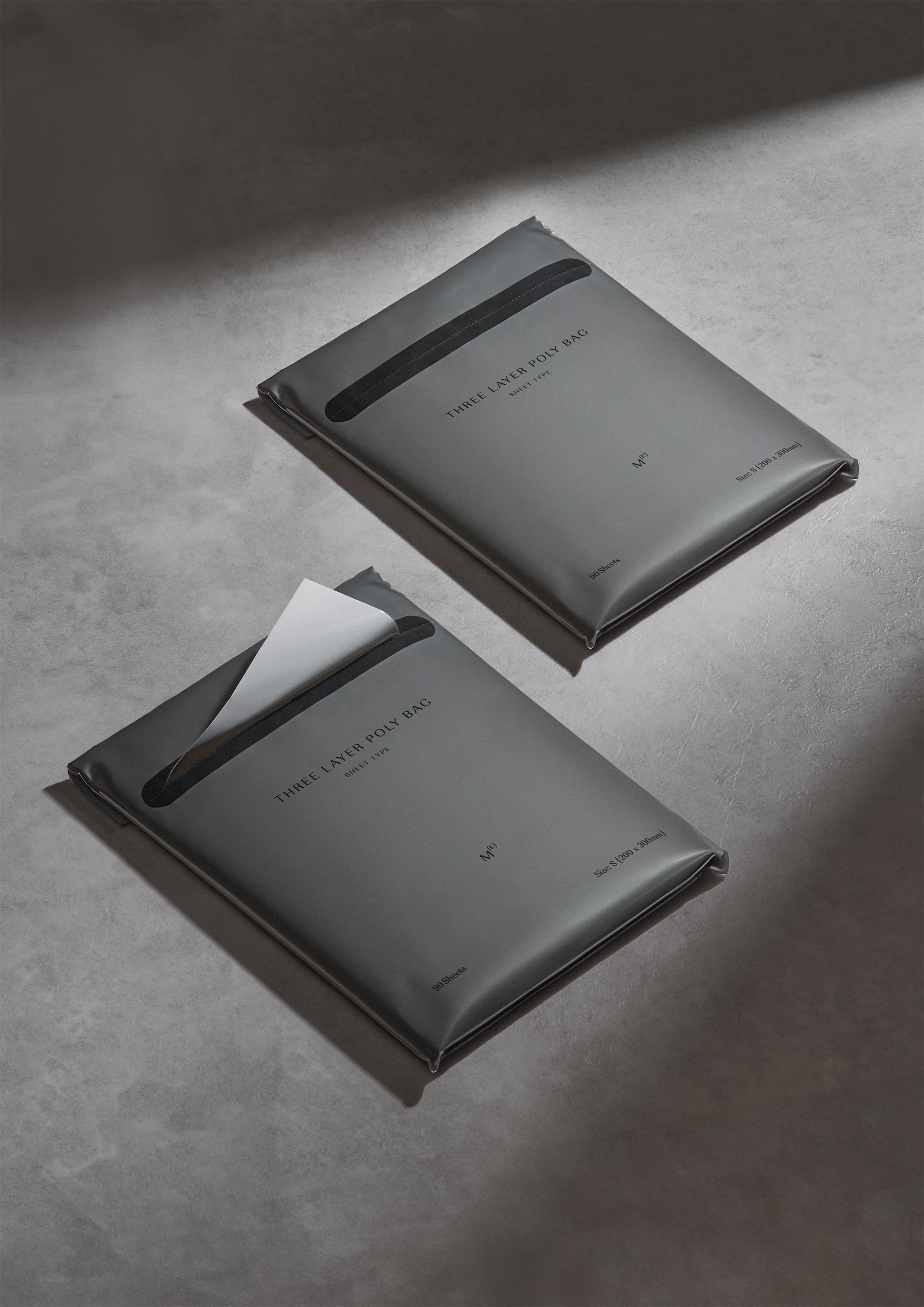
“The refill can be used as a sheet type. Normally, there are no products that have a design-oriented design for refills or plastic bag packaging, but we pay attention to aesthetics down to the smallest detail.”
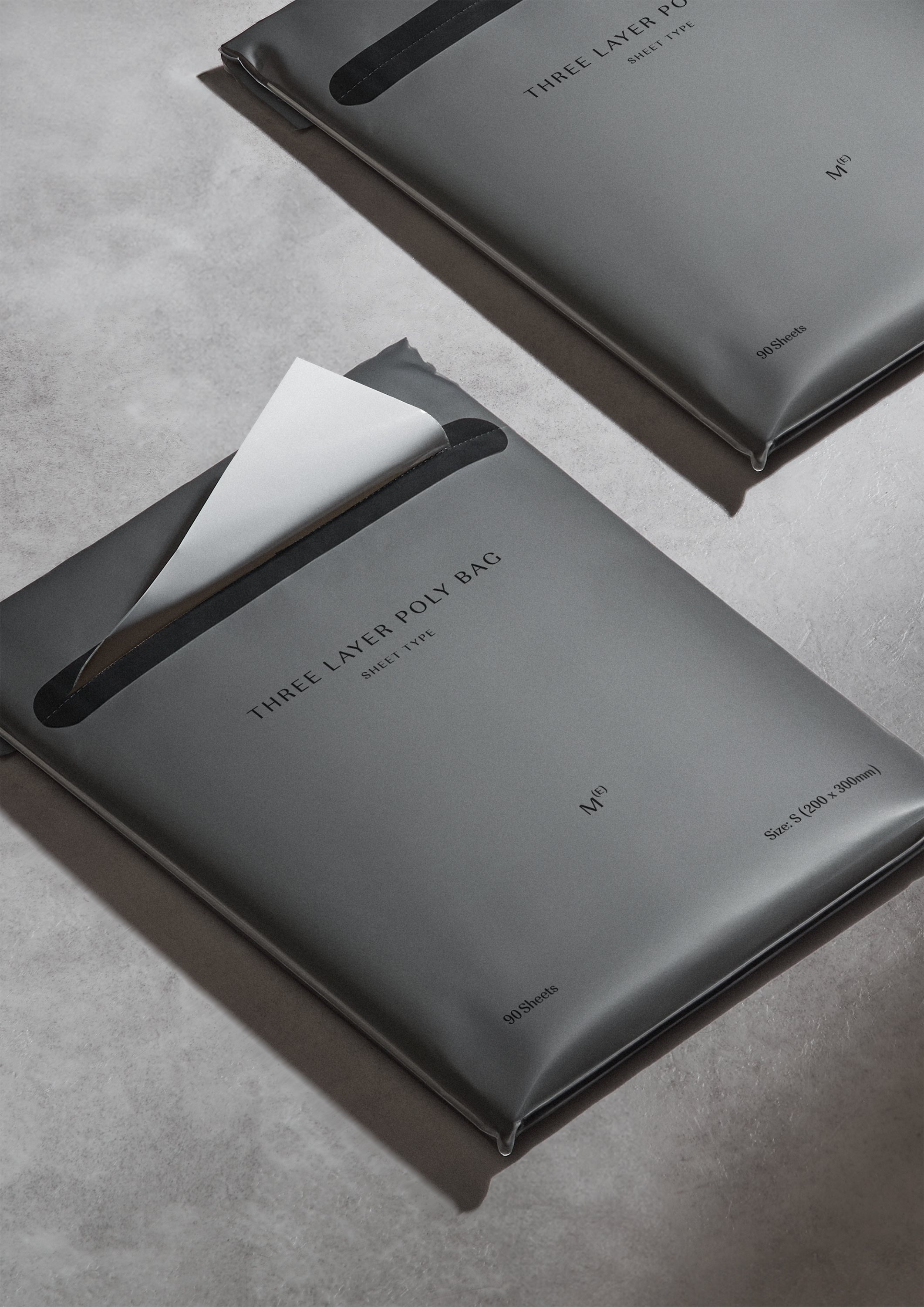
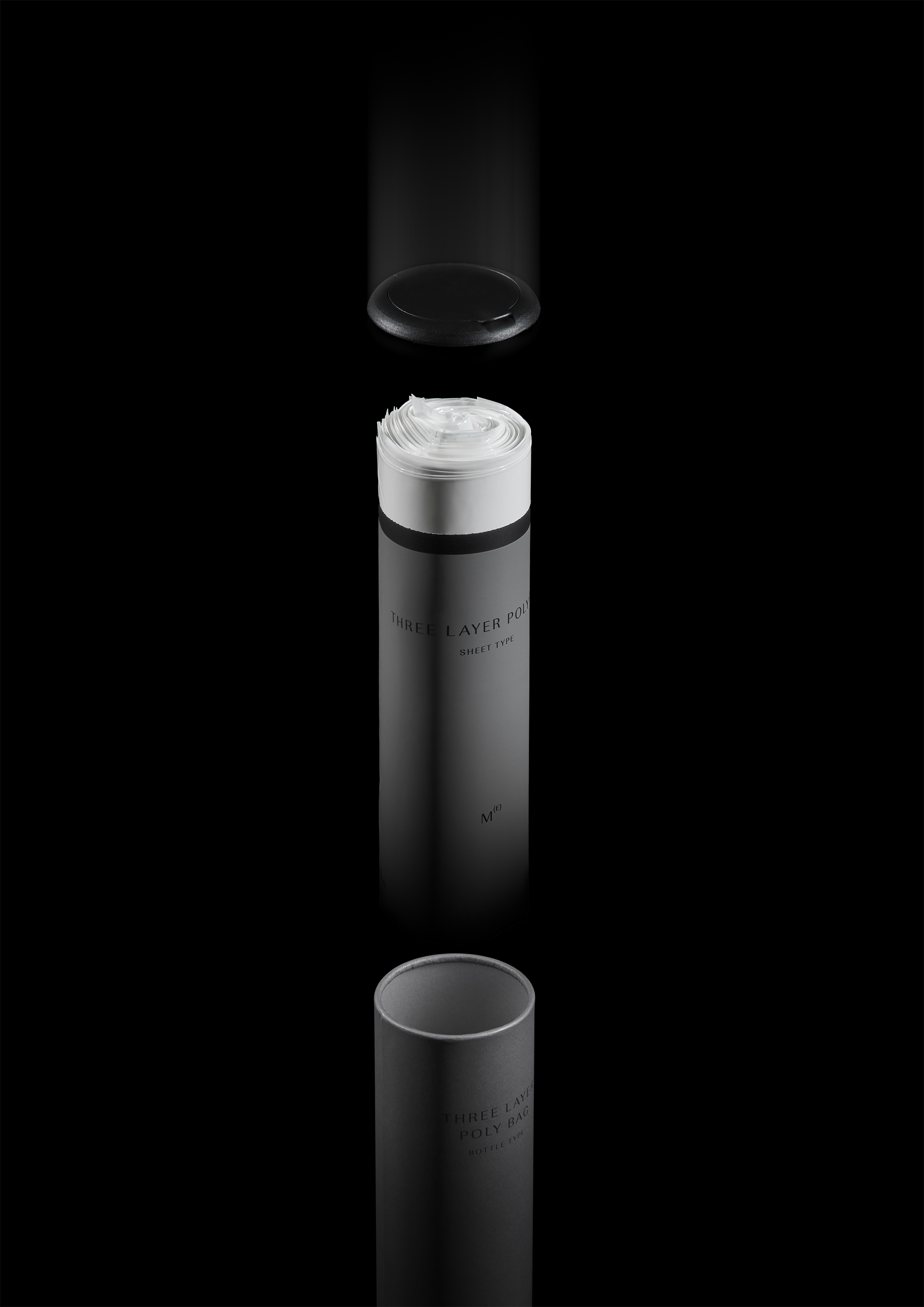
“When refilling into a bottle type, just cut off the top of the refill, roll it up, and put it in. It is an economical eco-bottle that can be used over and over again.”
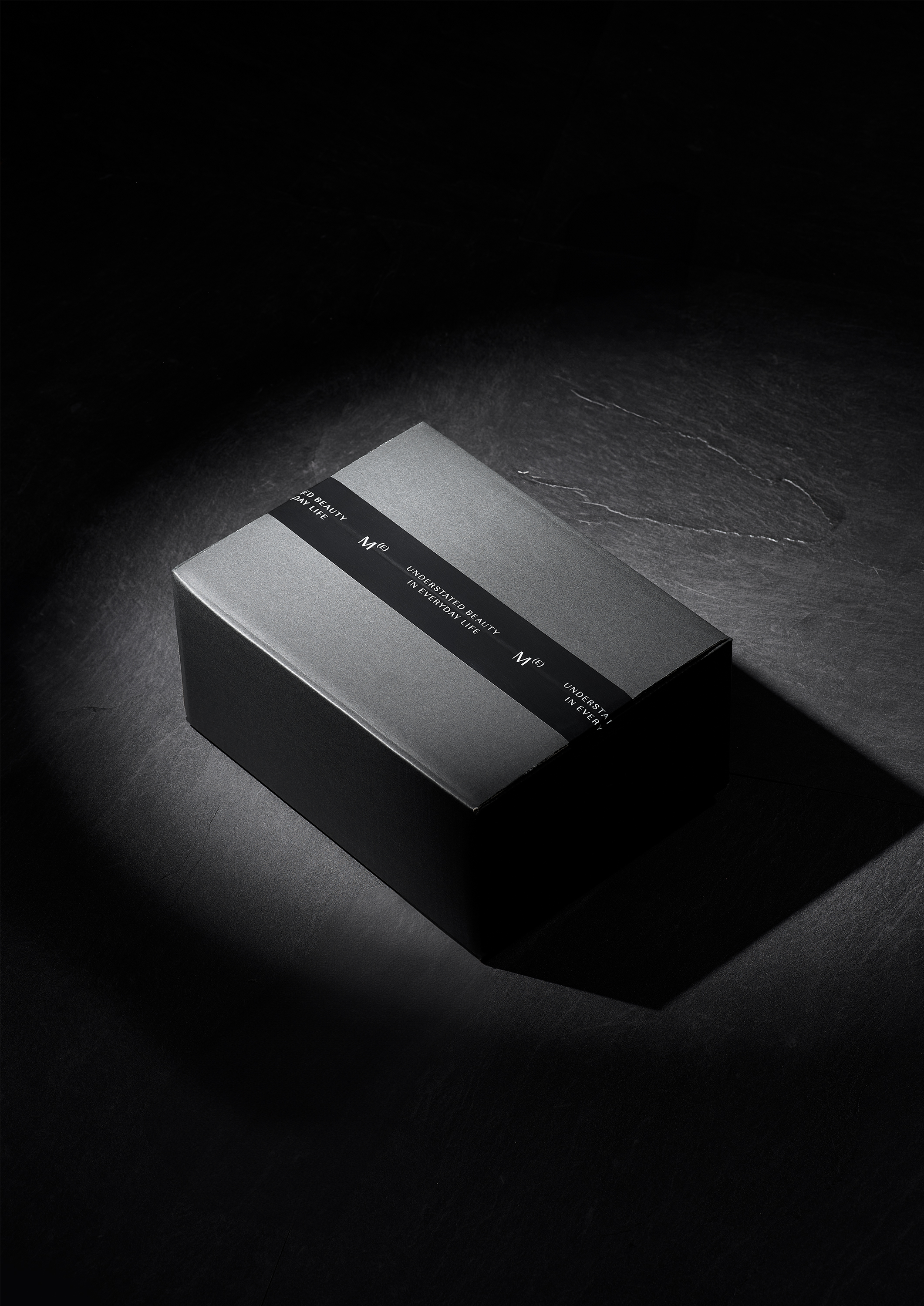
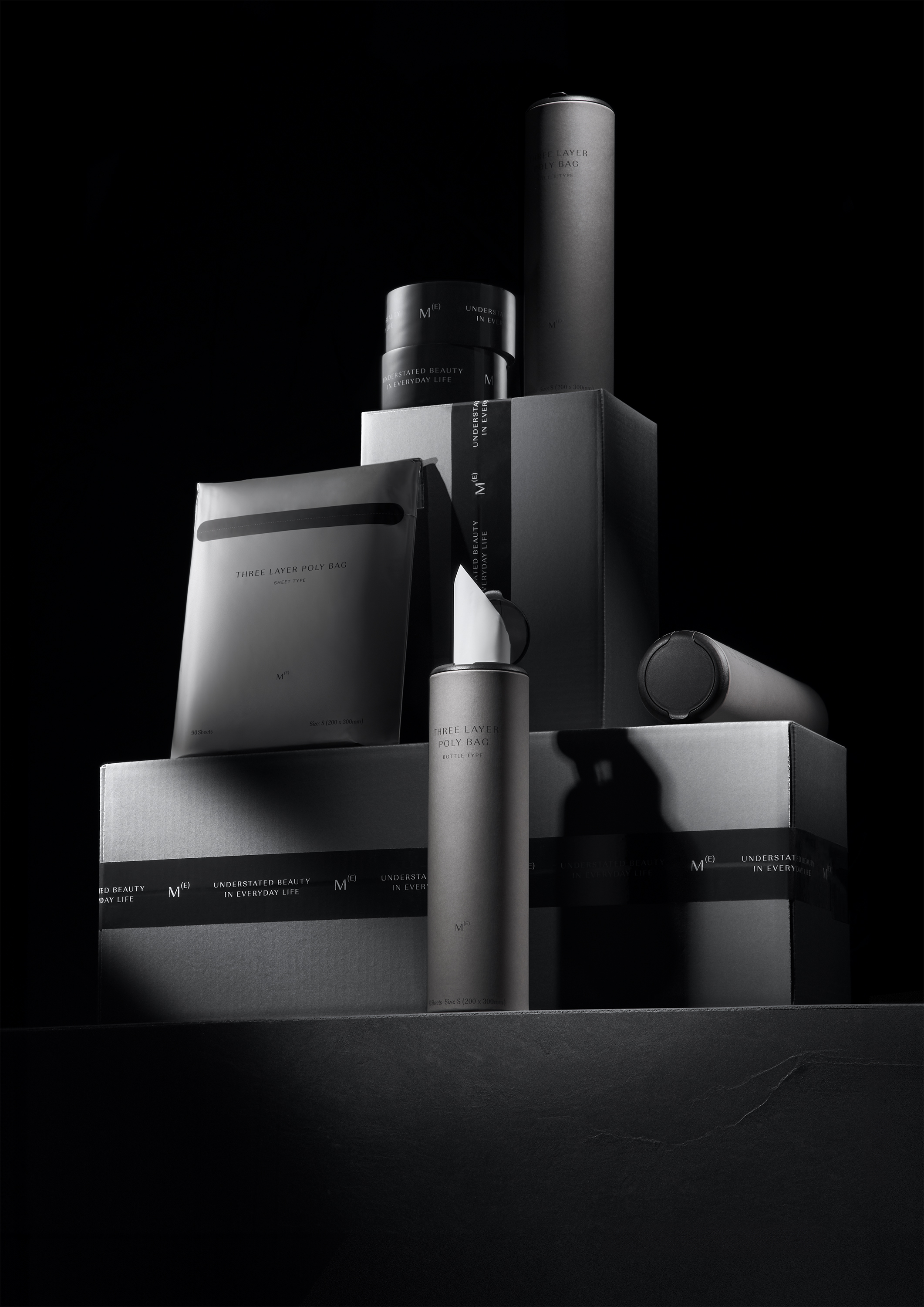
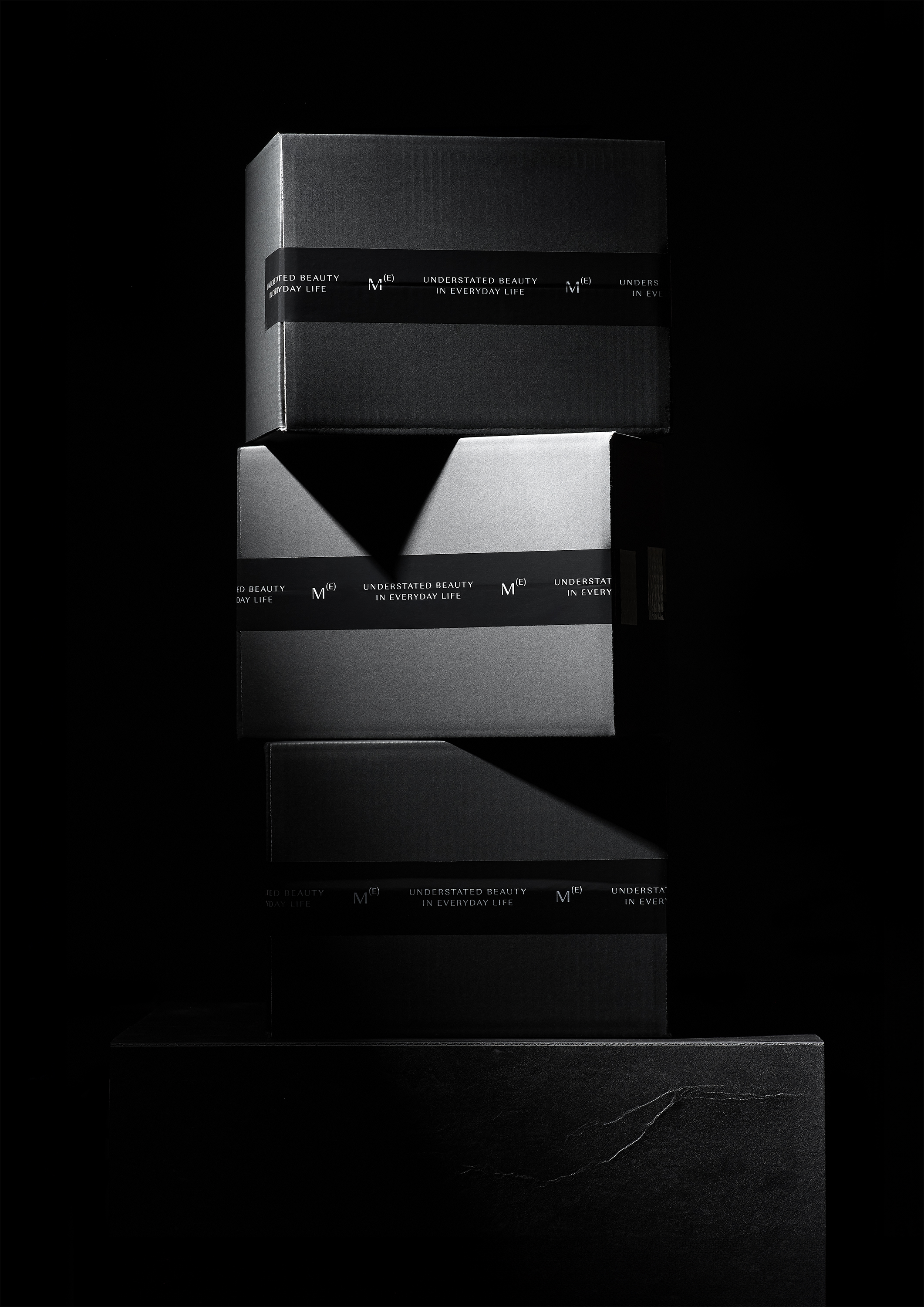
“The M(E) box is perfect as a gift. The beautifully designed poly bag is also the perfect gift for friends with babies or pets.”
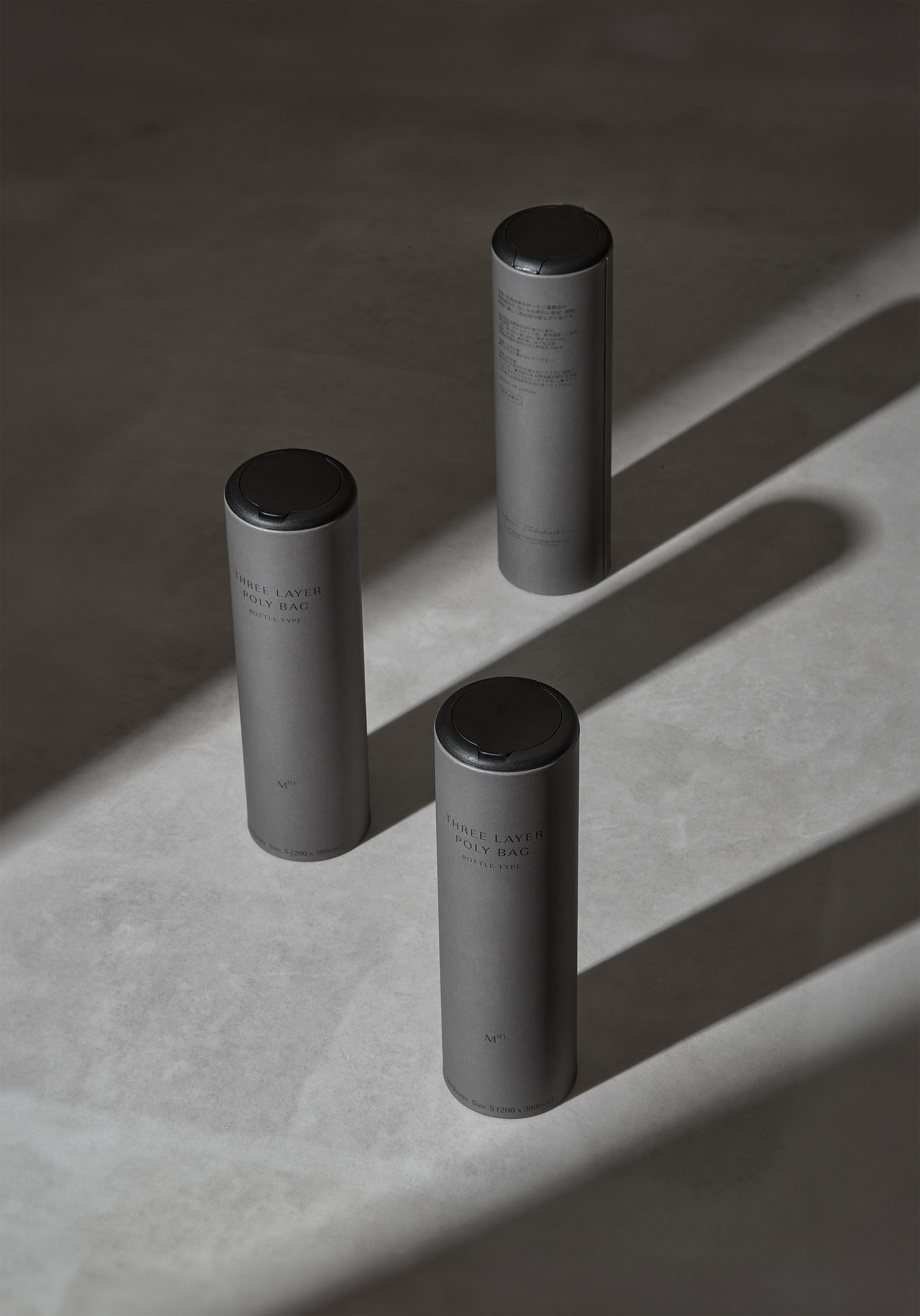
“The bottle shape, which is only 7 cm in diameter, fits neatly in the kitchen, dead space around the sink, and even in bottle folders in the car.”
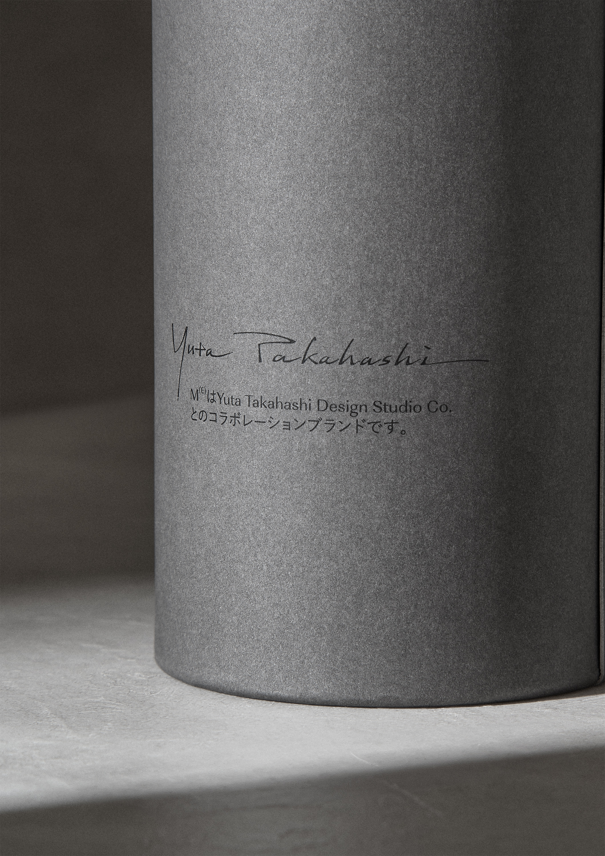
“On the back of the bottle is the designer’s signature, and below it is written, ‘M(E) is a collaboration brand with Yuta Takahashi Design Studio Co.,’ symbolizing the brand’s dedication to aesthetics.”
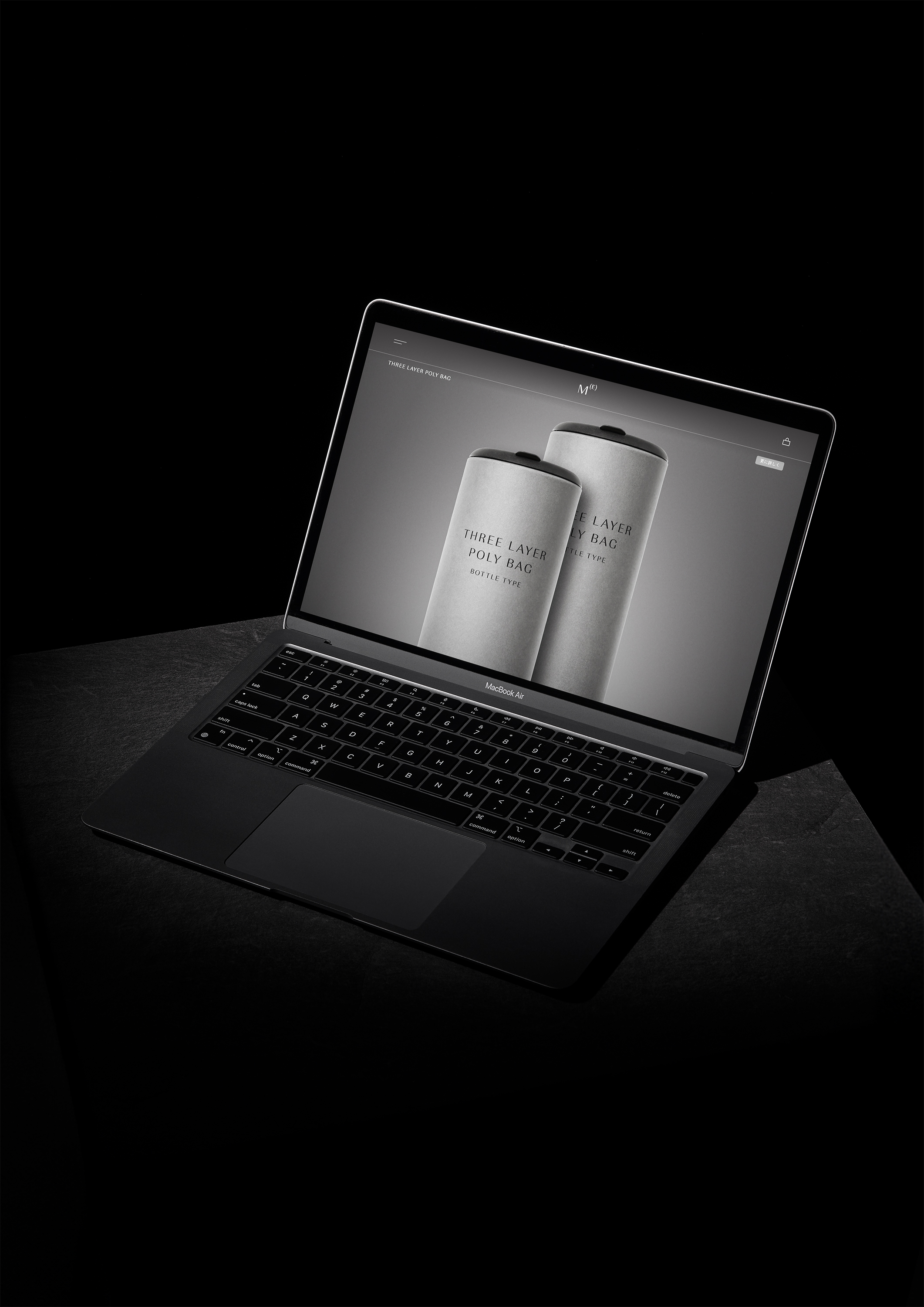
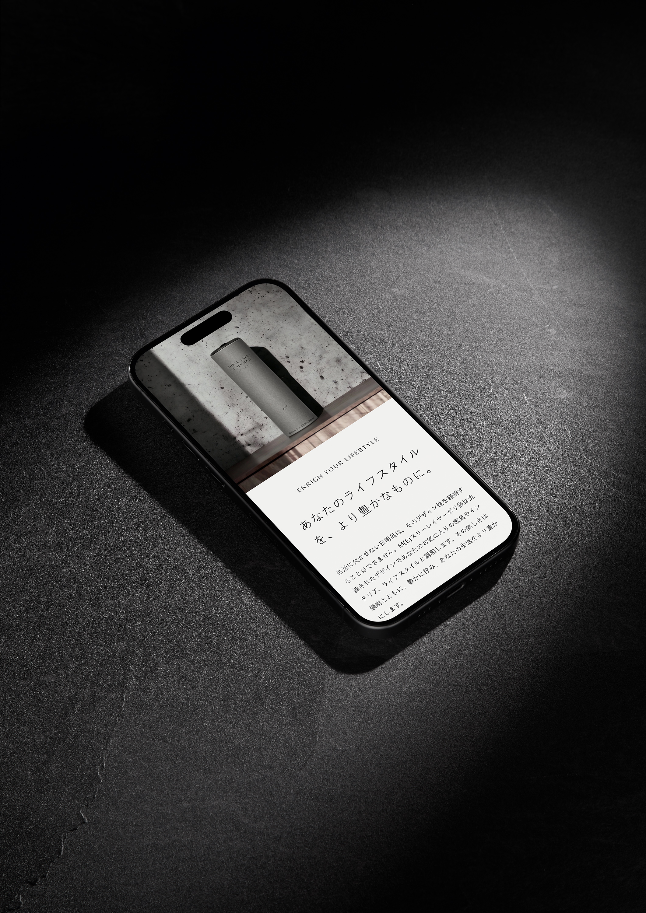
“The website has a simple and calming atmosphere, with easy-to-read and easy-to-understand navigation. It also enhances the emotional experience when purchasing everyday items.”