WTNB coffee & studio in the HOUSE
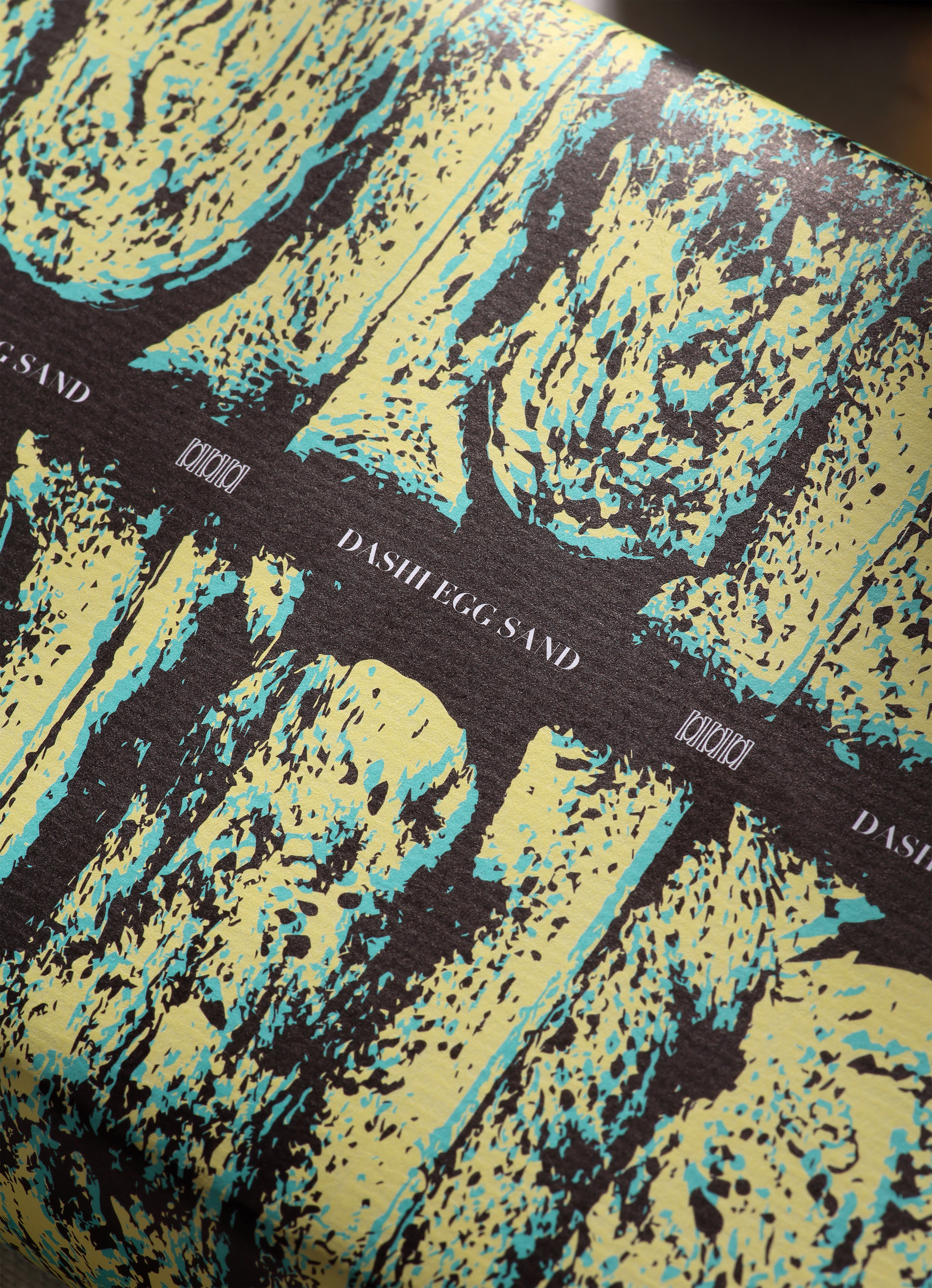
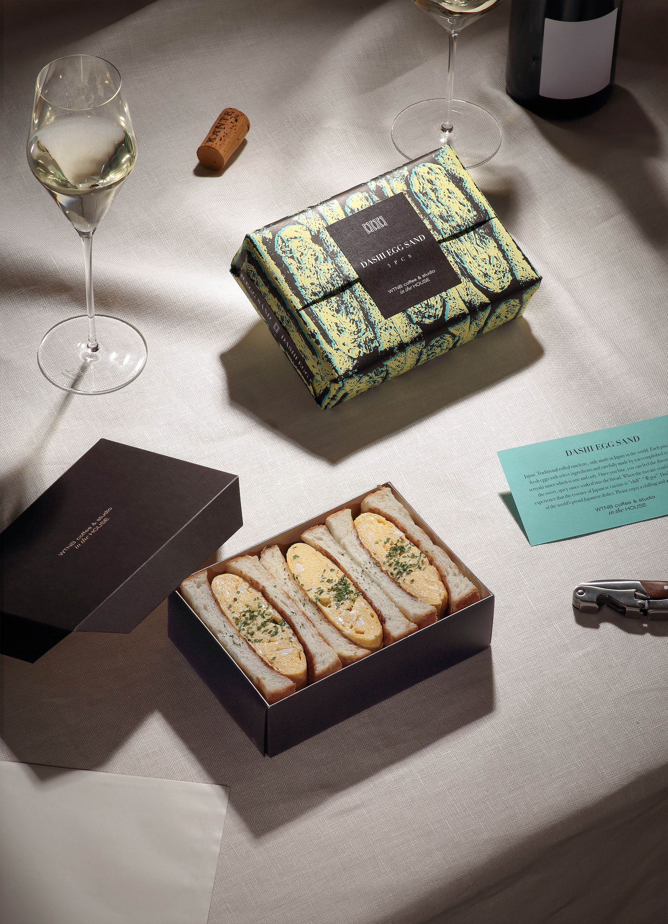
DASHI EGG SAND package design as a “vessel for enjoying food.”
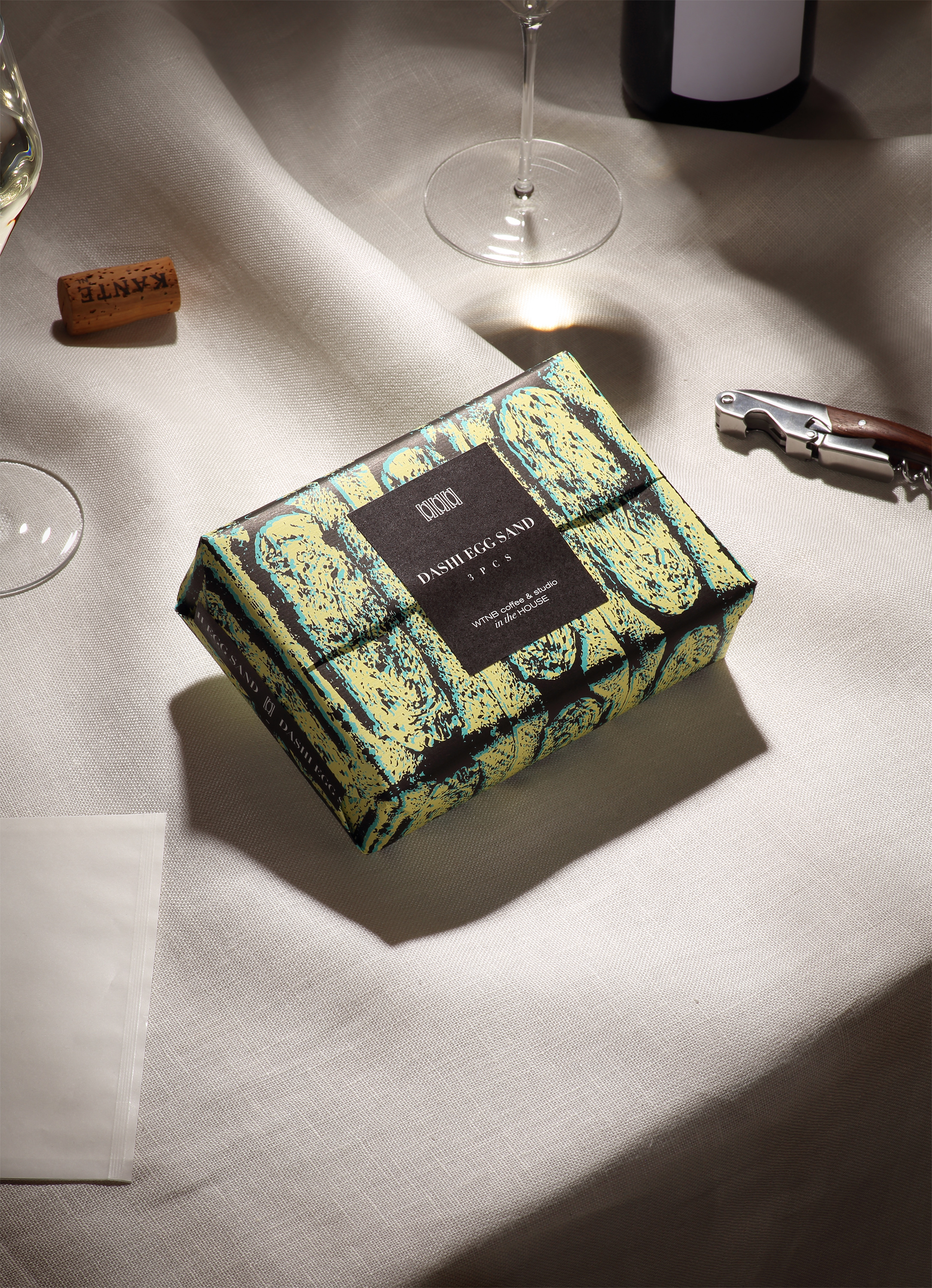
“Packaging as a ‘tableware’ necessary for an aesthetically pleasing dining experience can also be considered for take-out food. The demand for takeout food has increased due to COVID-19 and the importance of packaging as tableware, not just a meal.”
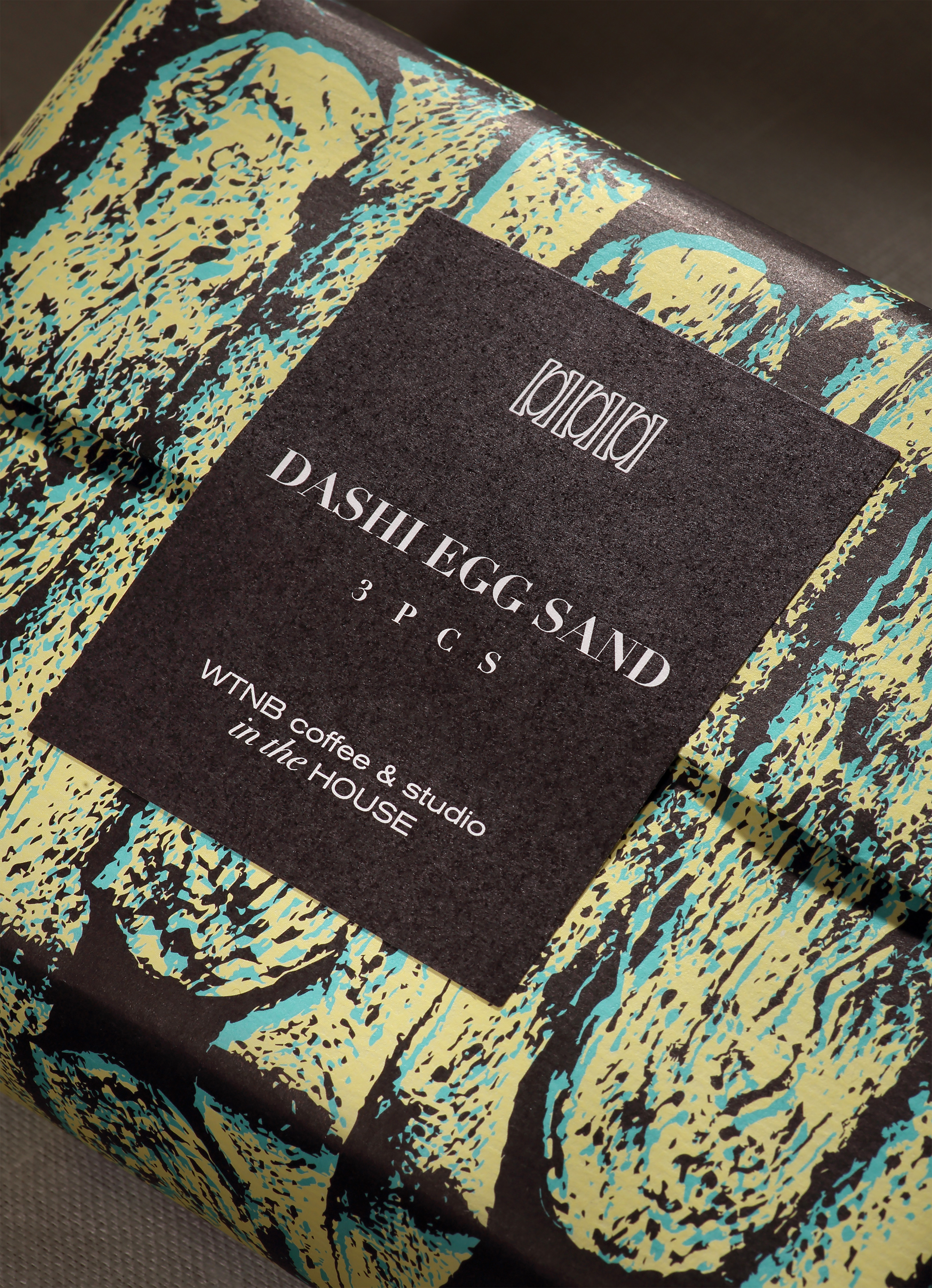

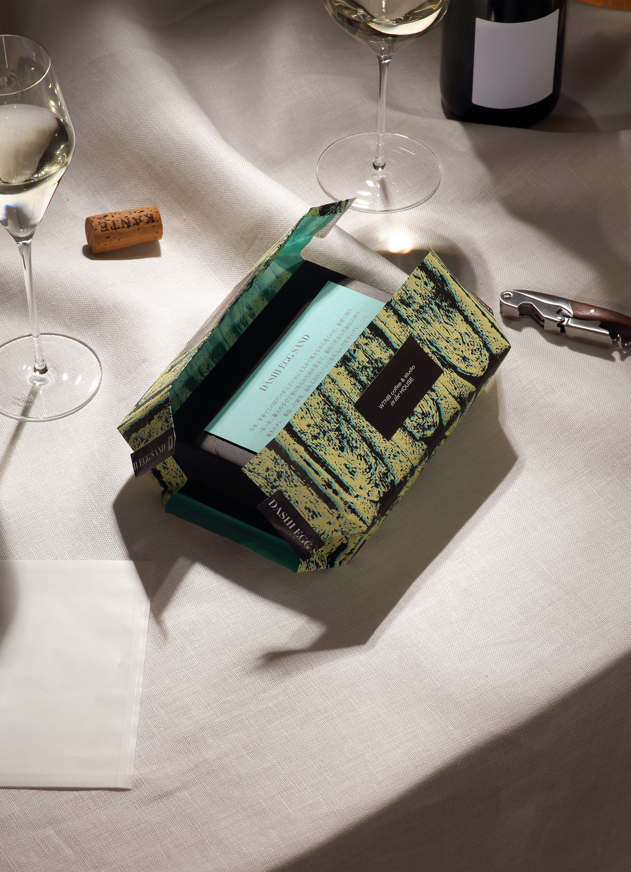
“The soft wrapping paper and its illustration are reminiscent of the gentle texture of dashimaki egg. The wrapping paper has a graphic abstracted from the cross-sectional view of a DASHI EGG SAND.”
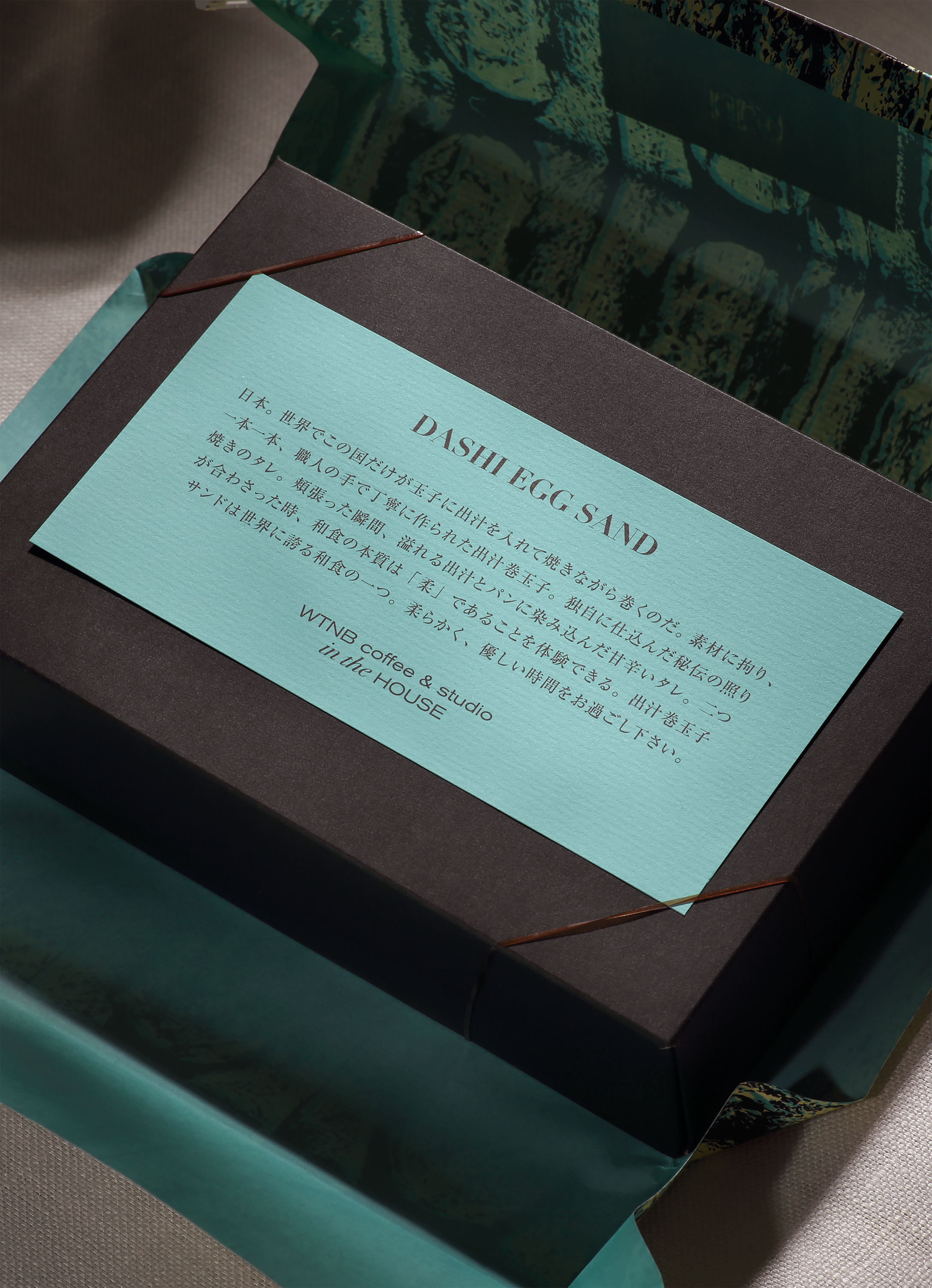

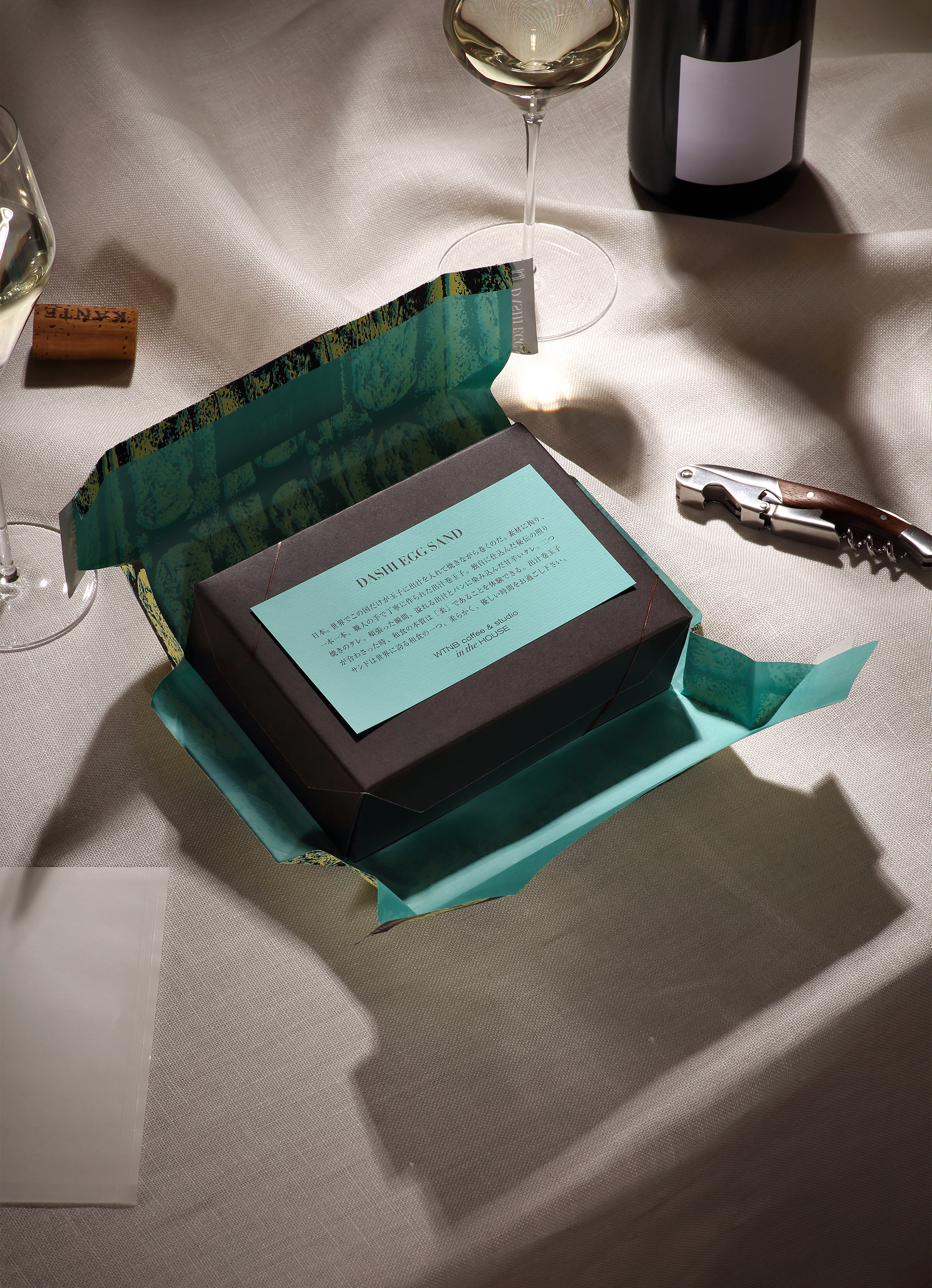
“The illustration represents the egg, the secret sauce, and the café’s signature color: blue claire. The box is made of unbleached kraft paper, which is specially treated to be water and oil resistant, eliminating plastic and film materials for environmental impact.”
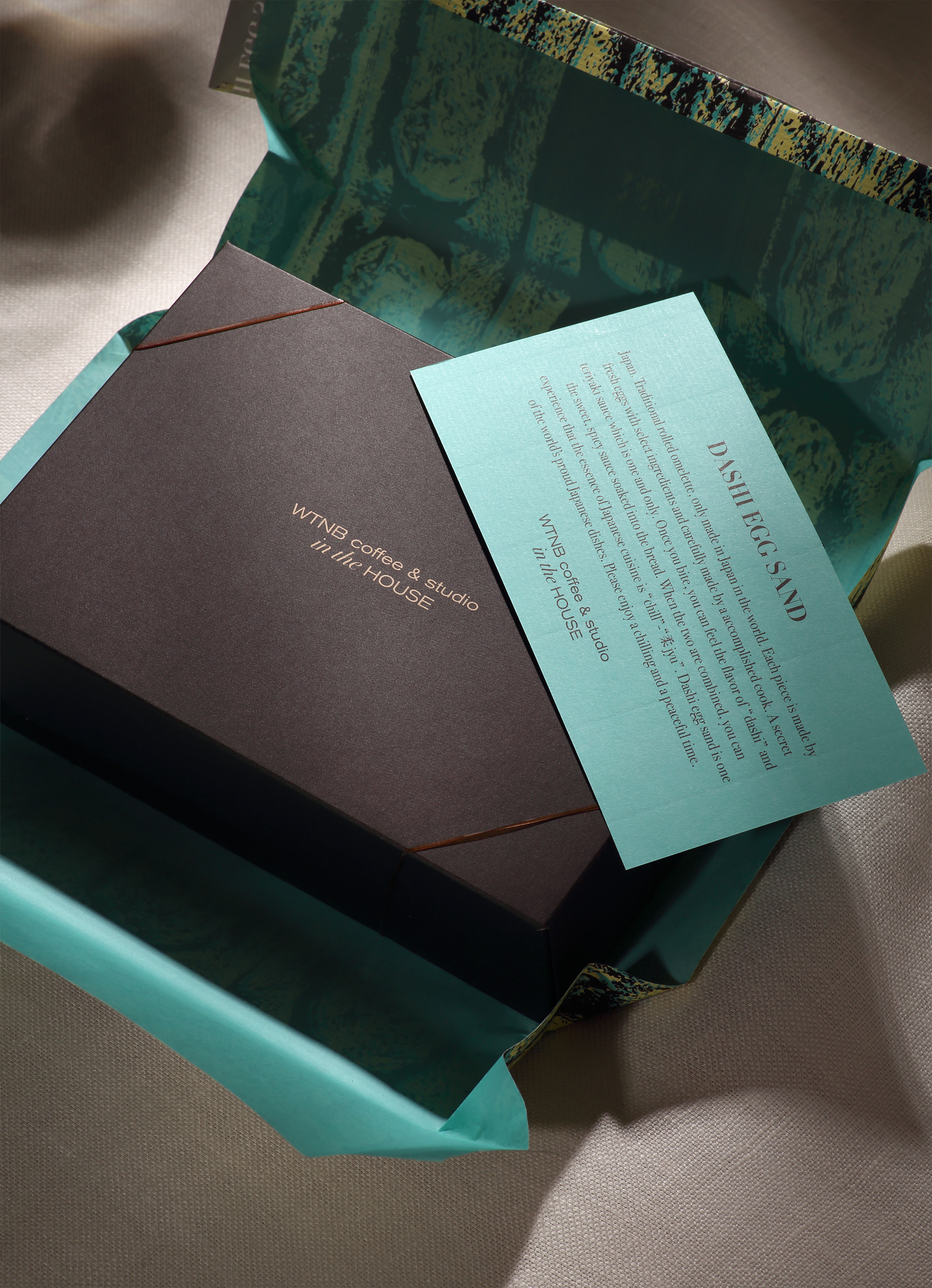
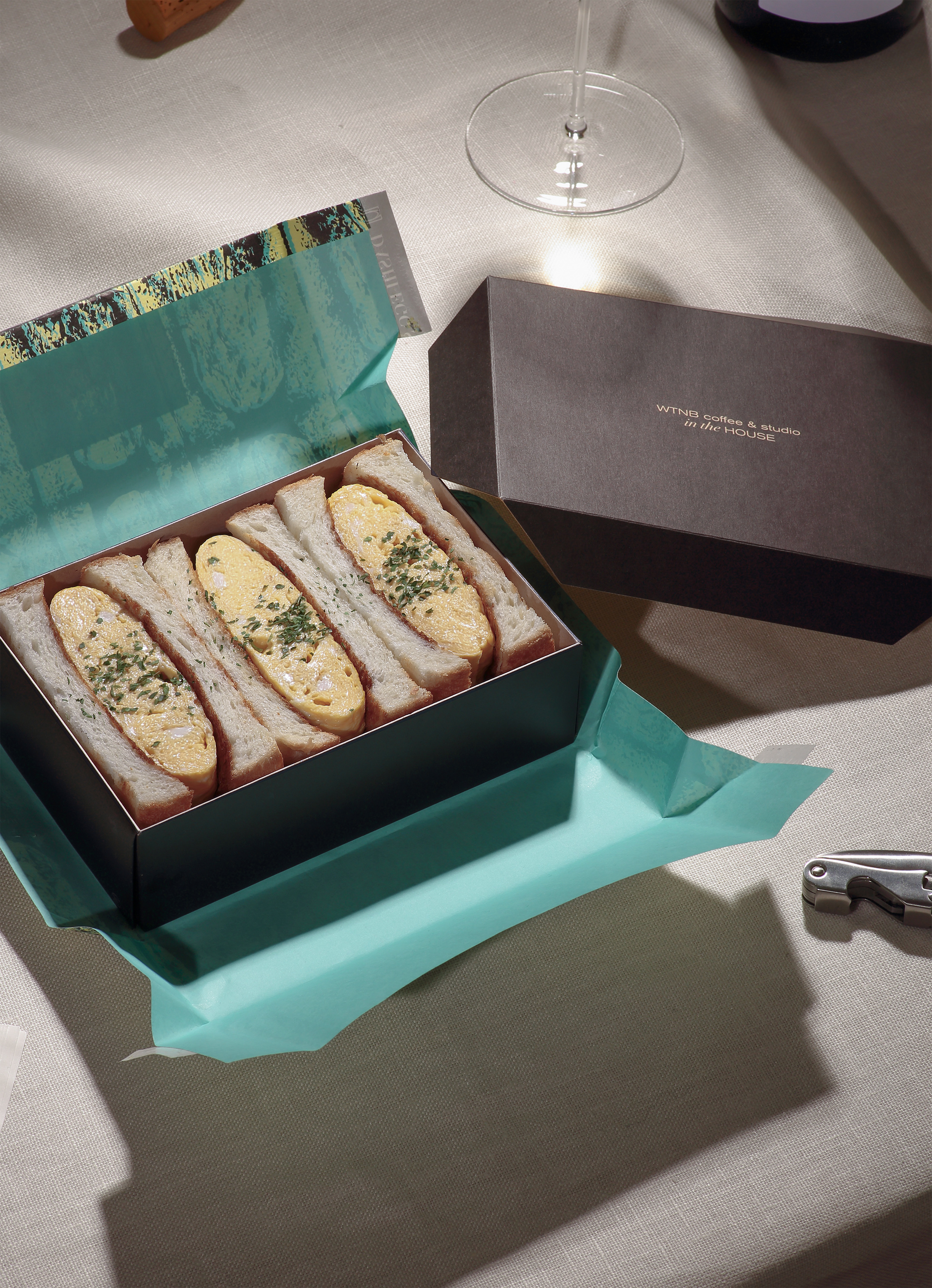
“When you open the softly wrapped wrapper, you are struck by the contrast between the bright blue claire and dark brown. Its packaging evokes the mood of a party or picnic. It is not just for satisfying hunger. It’s for a delightful mealtime experience.”