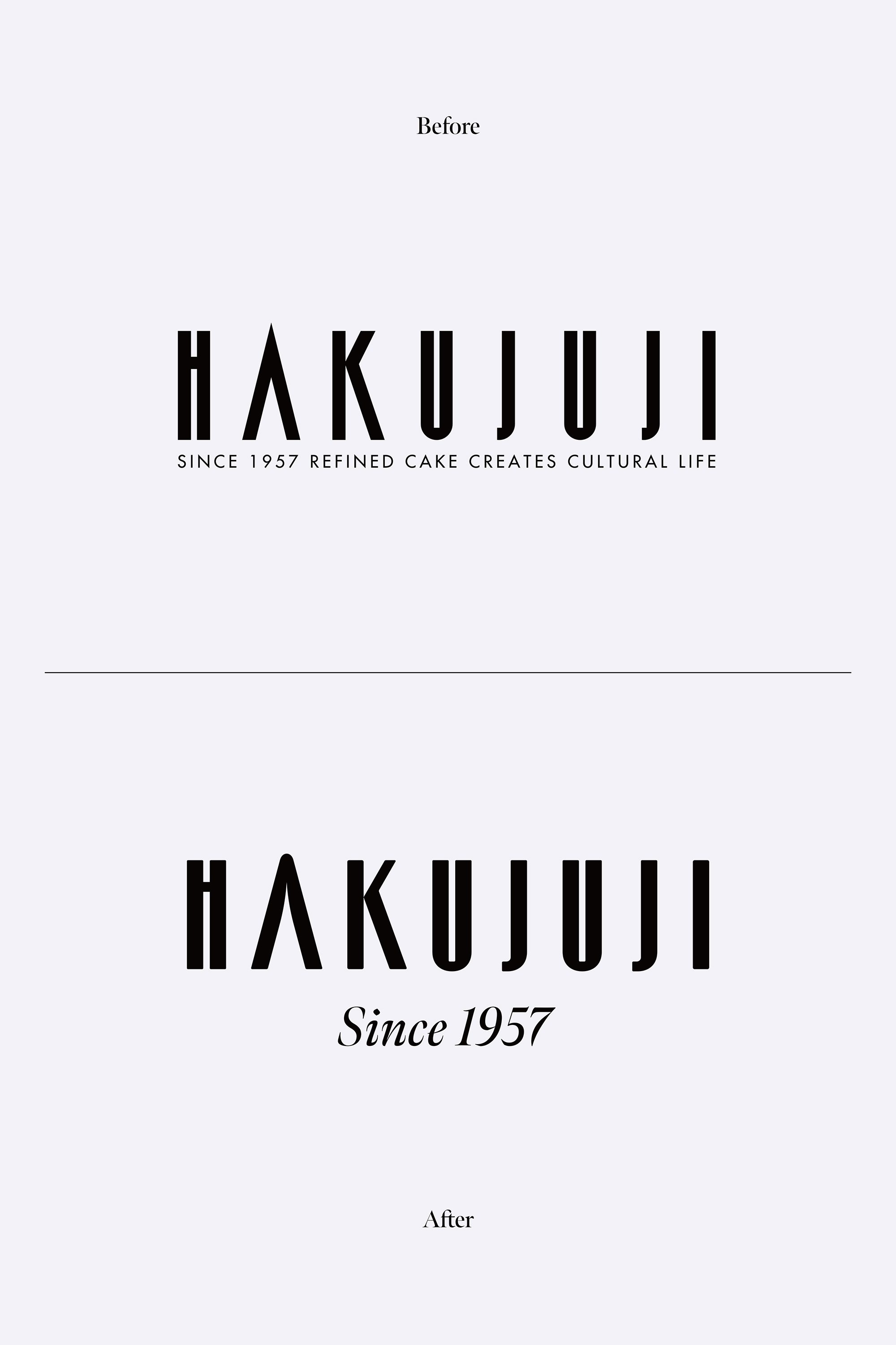
HAKUJUJI
We redesigned the VI for a long-established confectionery manufacturer founded in 1957 that operates 26 stores in the Chugoku and Kinki regions.
With a vision of "Handmade by people with love," Hakujuji operates 26 stores in Okayama Prefecture, the Chugoku region, and the Kinki region, based on the principles of "love for the community," "love for craftsmanship," and "love for humanity."
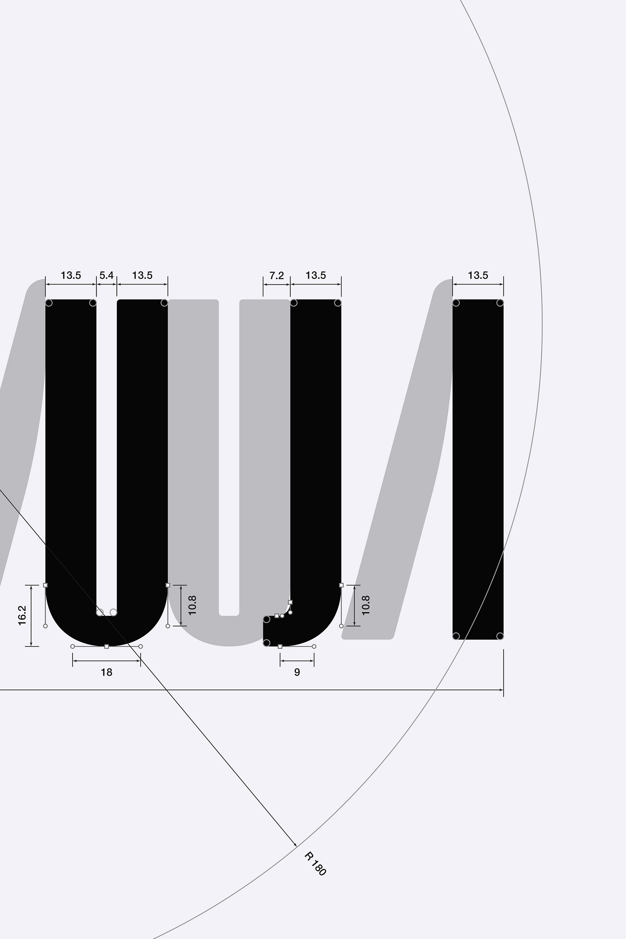
The previous logotype was used since 1983, leading the trends of the time with its dignified, urban impression. As times have changed, we have designed a more human, emotional, modern, and sophisticated logotype to further ground our confectionery in "love for the community," "love for craftsmanship," and "love for humanity."
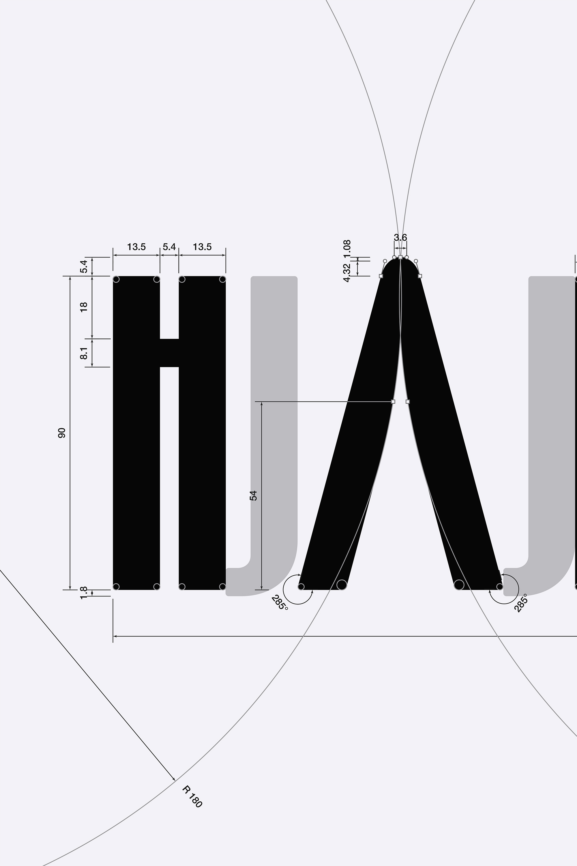
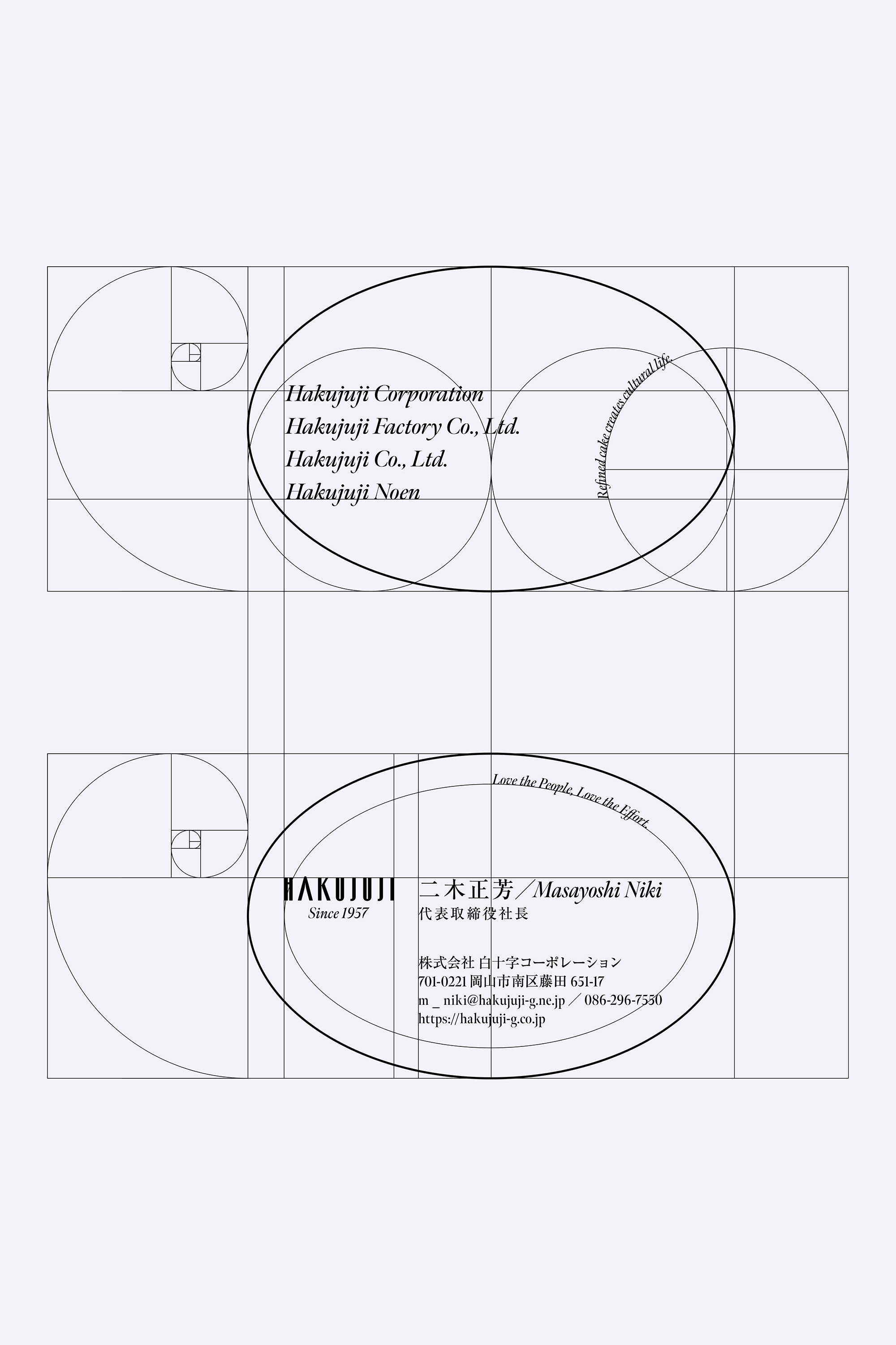
Each element of the logotype is inspired by the numbers that shape the natural world. The sum of the interior angles of a triangle is 180°, that of a square is 360°, and that of a pentagon is 540°, and if you break down and add up any of these numbers, you get 9. This same idea can also be found in the numbers that make up nature and the universe, such as the Earth's orbital speed: 108,000 km/h (1+8=9), the Moon's diameter: 2,160 miles (2+1+6=9), and Jupiter's orbital period: 4,320 days (4+3+2=9).
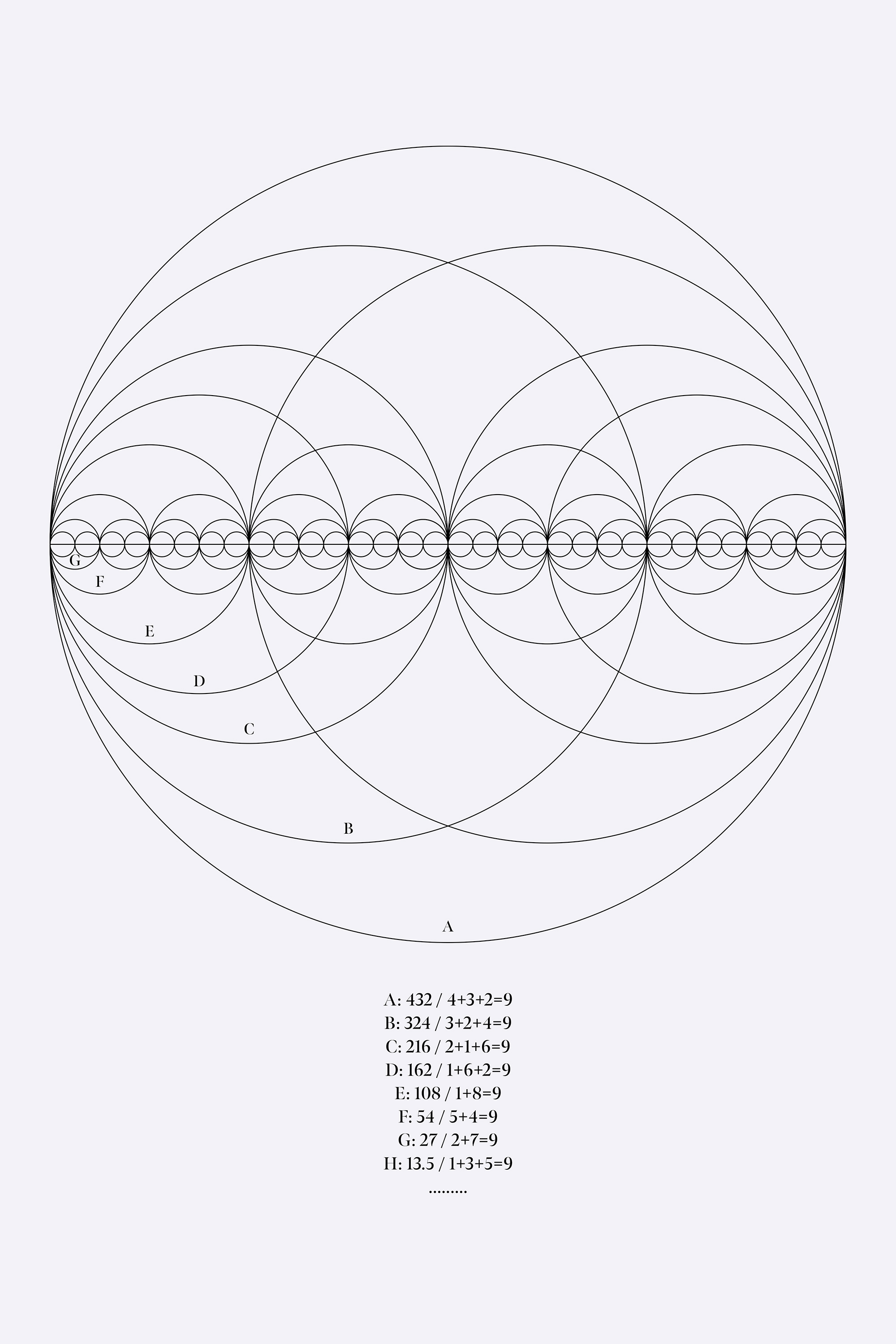
Furthermore, while the modern musical scale, equal temperament, is 440hz, the just intonation used until around the 18th century was 432hz (4+3+2=9). While equal temperament resonates softly outside the body, just intonation resonates inside the body, pleasantly resonating with the soul. Utilizing these numbers that make up the natural world and the universe, we designed a VI that is familiar and approachable, simple yet dignified and sophisticated.
Hakujuji Waffles have been popular since the company's founding and are now a beloved souvenir in Okayama. While the company produces a wide range of products, the passion that Hakujuji puts into their waffles is particularly strong.
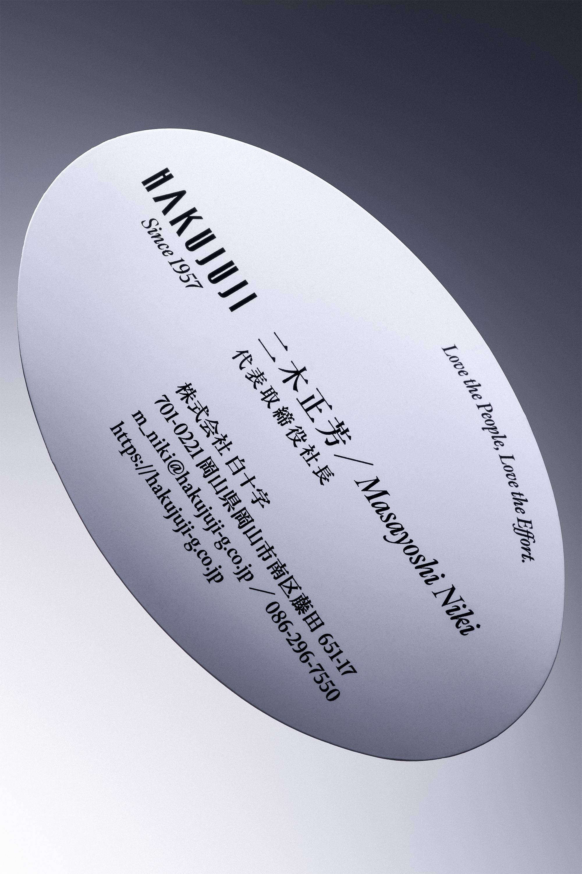
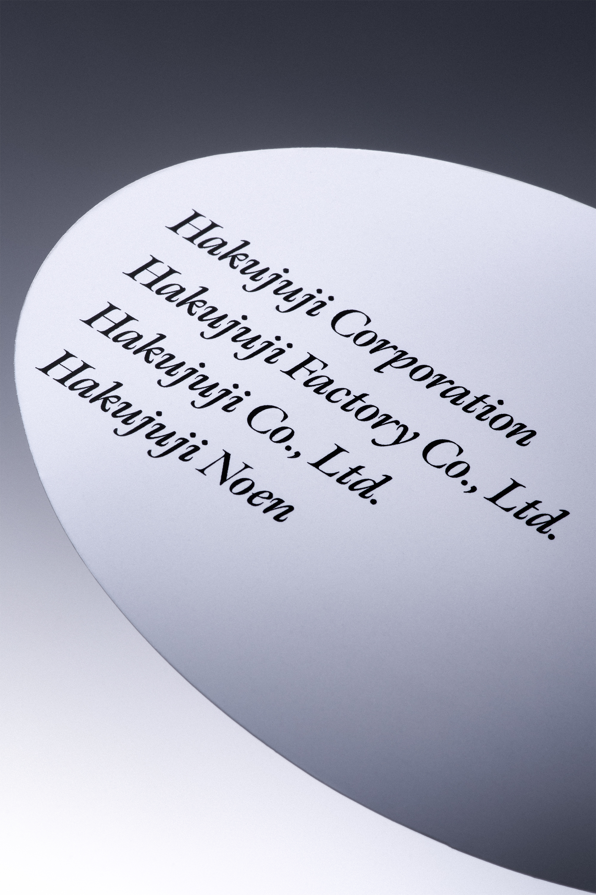
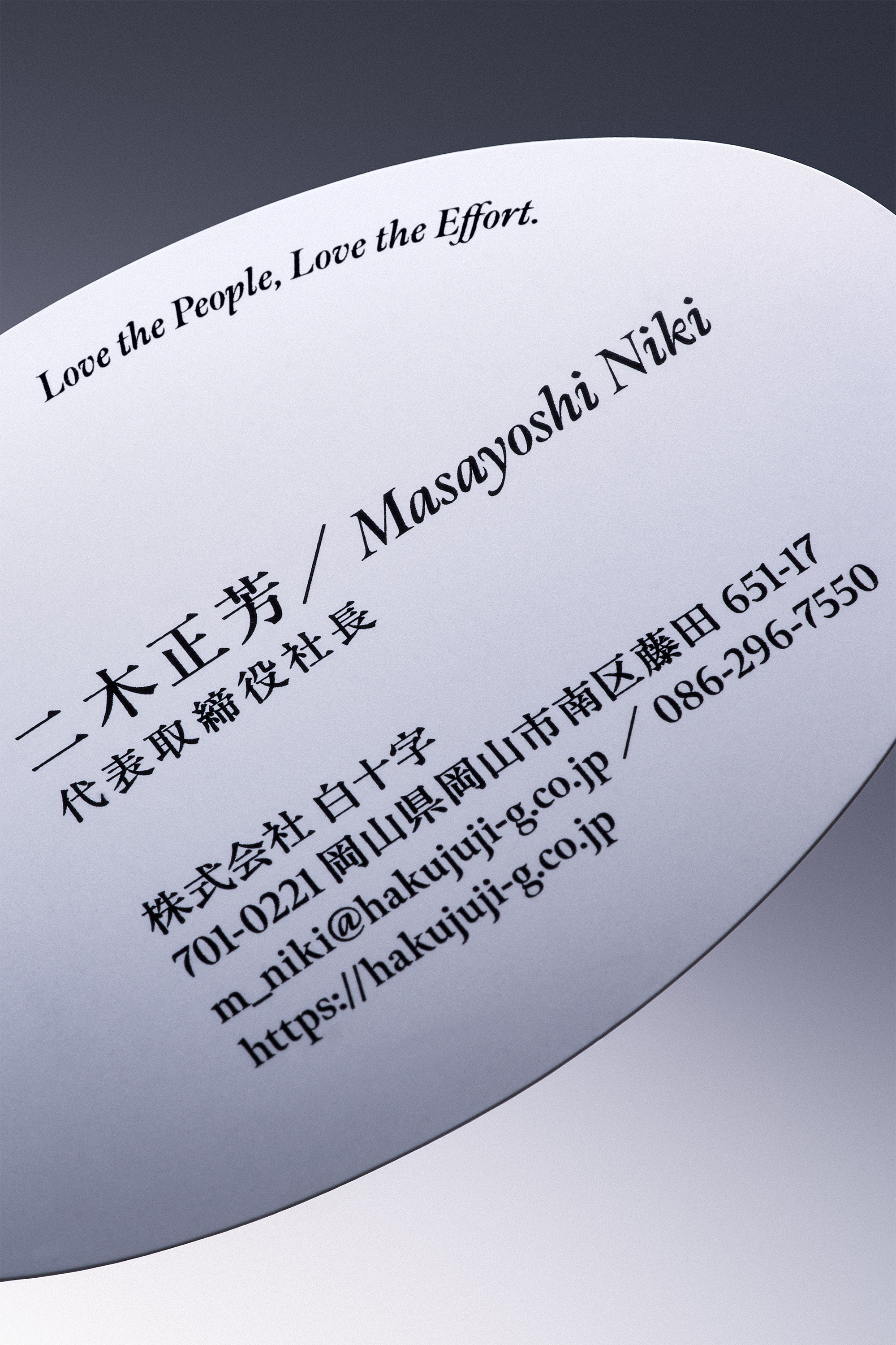
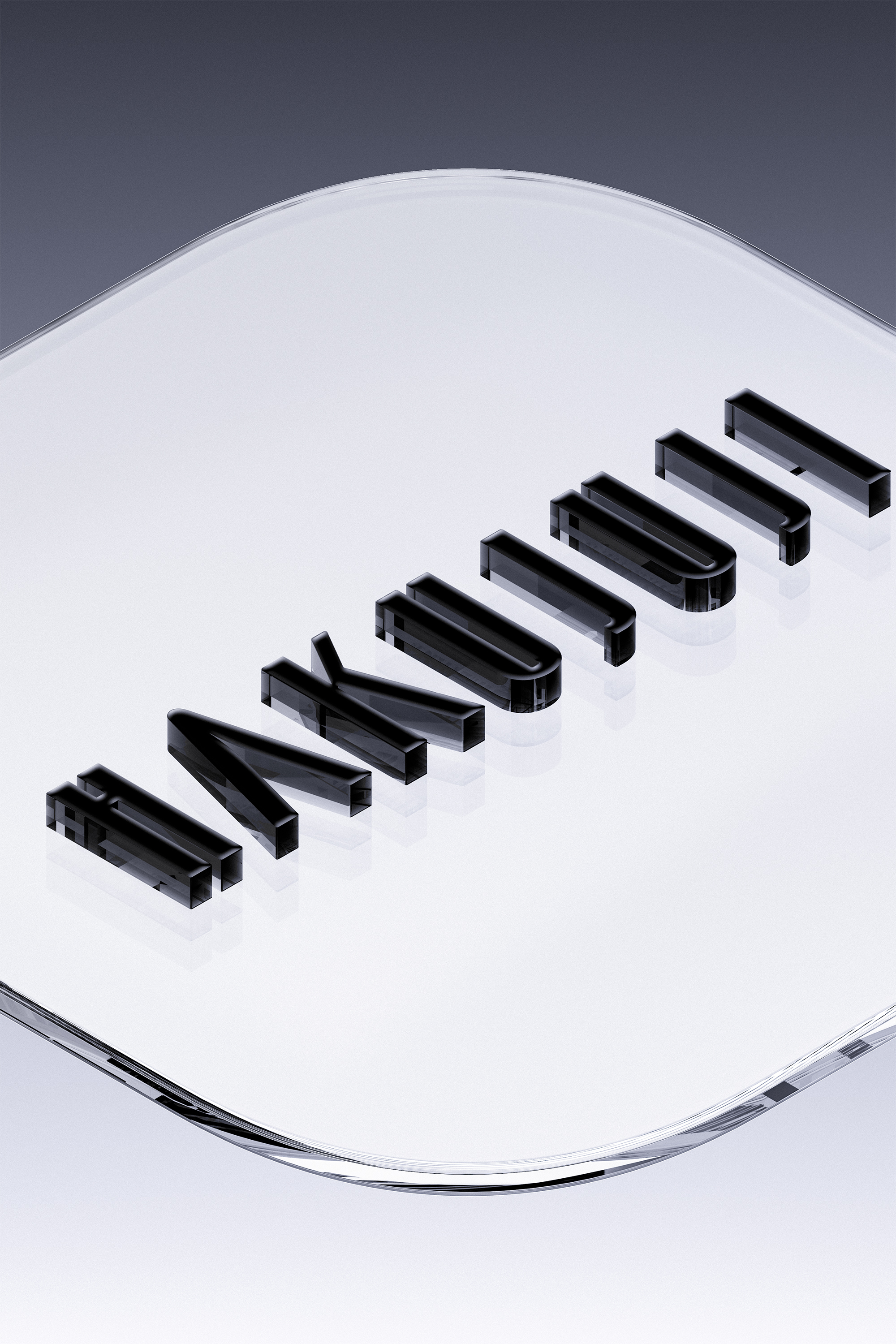
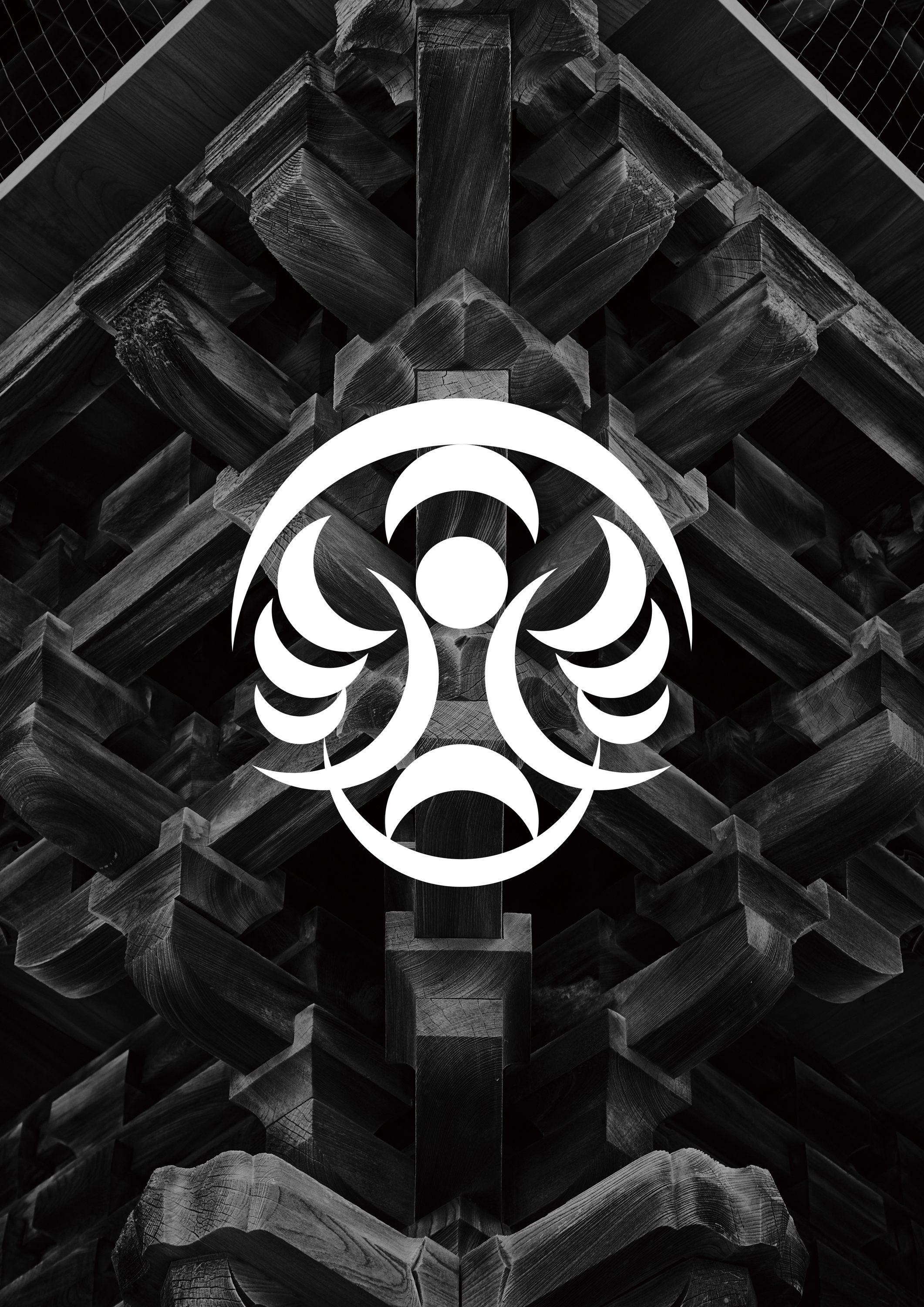
These fluffy, oval-shaped waffles are a testament to their unique character. This waffle shape has been incorporated into the shape of a business card, which serves as the face of a communication tool, and the graphic represents the swelling of the cheeks when one bites into a mouth full.